
People make snap judgements. Even before they read properly, their first reaction affects how credible and relevant the site feels.
Nielsen Norman Group talks about first impressions shaping perceptions like credibility and usability.
It’s also why speed and responsiveness matter: if the site feels sluggish, users stop clicking as readily because they feel less “in control”.
So if you’re a local business, trade, contractor, or small ecommerce brand, this is the reality:
Open your page (home page, service page, landing page, category page). Start a timer. Give yourself 10 seconds.
Can a first-time visitor answer these without scrolling?
This is about instant orientation: your logo, page heading, and design should clearly match the business.
Not “digital solutions” or “quality services” plain English.
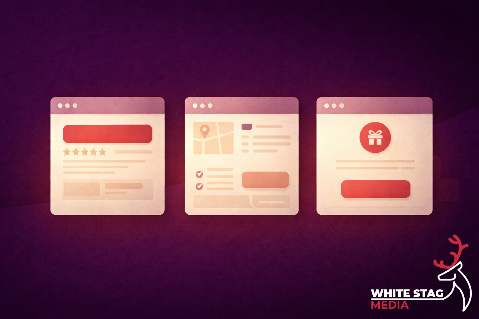
Good:
Vague:
One primary action. Not five.
Examples:
If your page fails this check, don’t start with a redesign. Start with structure.
Here’s the fast, high-impact sequence.
Your headline should say what you do, who it’s for, and (if relevant) where you do it.
A simple pattern that works:
Service + outcome + location
“Web design for trades in Manchester”
“Fast boiler repairs in Oldham”
“Spray equipment and accessories for decorators”
This is where you do the reassuring bit:
Example:
“Fixed-price builds. Clear timelines. You’ll know exactly what you’re getting before we start.”
Pick the action that matches the visitor’s intent on that page.
Common mistake: three CTAs competing (Call / Email / WhatsApp) all shouting at once. Put one first, the others can exist but shouldn’t compete visually.
People want a reason to trust you. One of these is enough:
This isn’t “marketing fluff” — it’s friction removal.
The “10 seconds” stays the same, but the “thing they came for” changes.
They came to confirm: who are you, what do you do, can I trust you?
They came to confirm: do you cover my area, do you do this exact job, how do I book?
They came to confirm: is this relevant to the ad, what do I get, what’s the next step?
They came to answer: where do I start?
This is where structure matters more than “more products”. Give people clear paths, a curated first view, and comparison/support content where it helps.
If you want to go beyond “I think it’s fine”, use a tool like Microsoft Clarity.
Two useful signals:
When you fix clarity and hierarchy, these usually drop.
If you want a simple formula you can copy:
Headline: What you do + who it’s for + where
Support line: What makes it easy / different
Primary CTA: One action
Proof: One trust element
Secondary links (optional): Services / Work / Pricing
It’s not glamorous, but it converts because it’s easy.

This isn’t just UX — it supports SEO as well, because better clarity usually means better engagement and more satisfied visitors.
Google Search Central is pretty explicit about rewarding helpful, people-first content rather than content made mainly to rank. If your pages are clear, specific, and genuinely useful, you’re aligned with that direction.
If you want, I can do a quick 10-second clarity audit on your home page and your main service page and tell you exactly what to change first.
If you’re planning a seasonal campaign and want clarity before committing time or budget, a quick review can help identify what matters and what doesn’t. No pressure. No upselling. Just a clear view of how to make your campaign work harder.
Get a free, no-obligation campaign review
Find out what will actually improve performance before launch.
Seasonal campaigns are where theory meets pressure. Tight timelines, high expectations, and real revenue on the line expose whether a campaign has been properly thought through - or simply rushed out the door.
The following case studies show how structured creative, clear intent, and reusable systems were applied across real Black Friday and Christmas campaigns balancing speed with quality under genuine commercial pressure.
Each project highlights a different aspect of campaign execution from conversion-focused web assets to animated social and PPC creative and how consistency across touch-points helped drive performance without sacrificing brand quality.
Explore the featured campaigns below to see how considered design and strategic execution translate into real-world results.