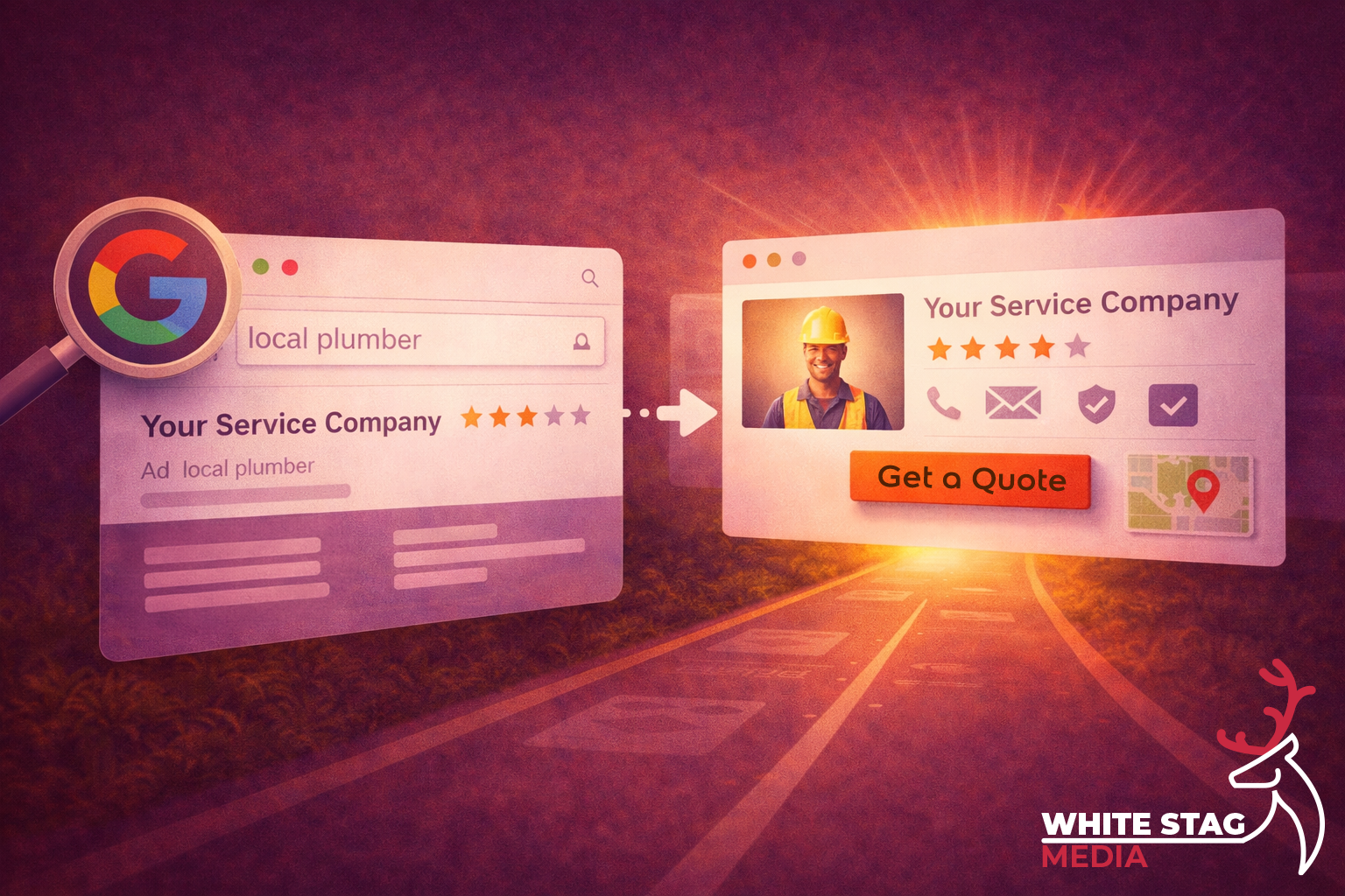
That matters because Google says local results are influenced by relevance, distance and prominence, and it recommends keeping your Business Profile complete and accurate so it can better understand your business and match it to relevant searches.
That is where a lot of small businesses lose people.
They put effort into getting found, which is fair enough. But once someone lands on the landing page, the page still has to back that click up. Google’s Search guidance says to use the words people would actually search for and put them in prominent places like the page title and main heading. That matters for SEO, but it matters just as much for clarity.
If the page is vague, slow, cluttered or unsure of itself, the click goes cold quickly.
This post looks at what your landing page needs to prove after a Google click, and where service businesses often make life harder than it needs to be.
Google Business Profile can help you win the search.
But the page after the click still has to do the heavy lifting.
Nielsen Norman Group has written a lot about first impressions, and one of the key points is that people form opinions about relevance, credibility and usability very quickly. It also recommends making it clear what the company does, especially for visitors who do not already know the business.
That same thinking applies to service pages and landing pages too.
People should not have to work out what you do.
There is a speed angle too. web.dev is clear that performance is part of user experience, and that speed and responsiveness affect whether people stay or leave. So if the page is unclear and sluggish, you are giving people two reasons to drop off instead of one.
If someone lands on your page from Google, the first screen should usually answer four things:
1) Service
do you do the exact job they need?
2) Area
do you work where they are?
3) Trust
is there a reason to feel confident in you?
4) Next Step
what should they do now?
That is the basic check.
It is not about making the page clever. It is about removing doubt quickly.
Google wants useful, relevant, people-first content in prominent places, and UX research shows people make trust and relevance judgements fast. Put those together and the takeaway is pretty straightforward:
the first screen should make the decision easier, not harder.
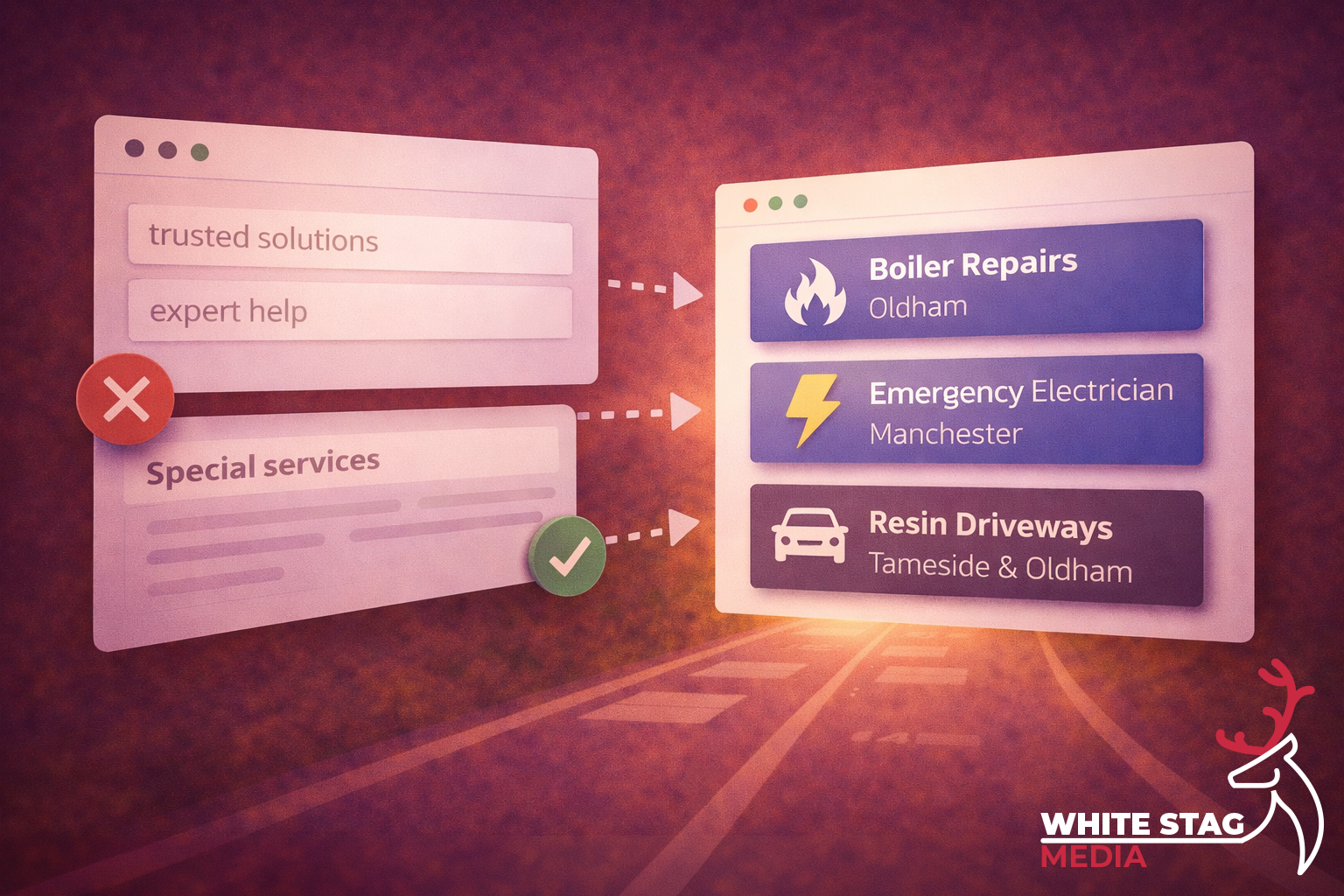
One of the quickest ways to weaken a landing page is vague copy.
Google’s Search Essentials says to use the words people would actually use to look for your content, and to place those words in prominent locations like the title and main heading. So instead of saying things like:
say the actual service.
Examples:
A simple formula that works well for service businesses is:
Service + outcome + location
For example:
It is clearer, more useful, and easier to trust because it sounds like it knows what it is there to do.
This is one of the easiest places to lose an enquiry.
Google says distance is one of the core local-ranking factors, and it also recommends keeping your business information accurate and up to date. If the listing suggests one thing but the landing page is vague about where you actually work, that creates doubt straight away.
You do not need to overcomplicate it.
Usually, one clear line does the job:
For most pages, I would make the area obvious in one of these places:
The point is not to cram every town into the first screen.
The point is to remove the doubt that makes someone hesitate.
Trust does not need to be dramatic, but it does need to be visible.
Nielsen Norman Group has written about trustworthy design and highlights things like design quality, current content, upfront disclosure and visible credibility signals. It also ties first impressions closely to trust.
So if your proof is buried halfway down the page, it is not helping when it matters most. For a local service business, one strong proof point near the action is usually enough:
You do not need a wall of badges and logos.
You just need one good reason for someone to think:
“Right, this looks legit.”
A lot of pages get weaker because they make the next step feel messy.
Google’s people-first content guidance is really about helping people get what they came for, and that usually means making the primary action obvious instead of giving equal weight to five different buttons.
That does not mean you can only have one contact method.
It means one action should lead.
If the job is urgent, Call now might make more sense.
If it is planned work, Get a quote is usually the clearer route.
A good quick check is:
This part is easy to underestimate.
web.dev is clear that performance is part of the overall user experience, and that slow or unresponsive pages make it more likely people will leave.
For service businesses, most of the mobile check is common sense:
You do not need to obsess over every tiny score before fixing the obvious stuff.
But you do need a page that feels easy.
If you want to get past guesswork, use a behaviour tool like Microsoft Clarity.
Clarity explains that rage clicks can point to frustration, while dead clicks show where people click and nothing happens. Microsoft says these patterns can reveal broken elements, misleading UI, confusion or latency issues.
That is useful because it shows you where the page is making people work.
A few things worth watching for:
That is where you start getting answers based on behaviour instead of opinion.
If you want a practical starting point, use this:
Headline
What you do + where you do it
Supporting line
Who it is for, what makes it easier, or what happens next
Primary CTA
One clear action
Proof point
Review score, testimonial, accreditation, or real work
Secondary links
Services, pricing, portfolio, contact
It is a simple structure, but it does the job.
It makes the decision easier and removes some of the friction that costs service businesses leads.
That lines up well with Google’s guidance on clear, relevant, people-first content and with UX research around clarity, trust and first impressions.
On their own, these are not massive problems.
Put a few of them together though, and the page starts to feel harder work than it should.
And that is usually when people leave.
Getting the click is not the finish line.
It is the handoff.
Google can help you get found through relevance, distance and prominence, but the page after the click still has to confirm the choice.
If the service is clear, the area is clear, trust is visible and the next step is obvious, you make it easier for the right person to move forward.
That is better for the visitor, and it is in line with the wider direction Google keeps pushing too.
If you are getting traffic from Google but you are not sure the page is doing its job properly, that is usually where I would start.
A good landing page does not need to be flashy.
It needs to make the next step feel obvious.
If you want, I can take a quick look and point out a few simple things that may be making the page harder to trust, harder to understand or harder to act on.