This does two things instantly:
Practical tip:
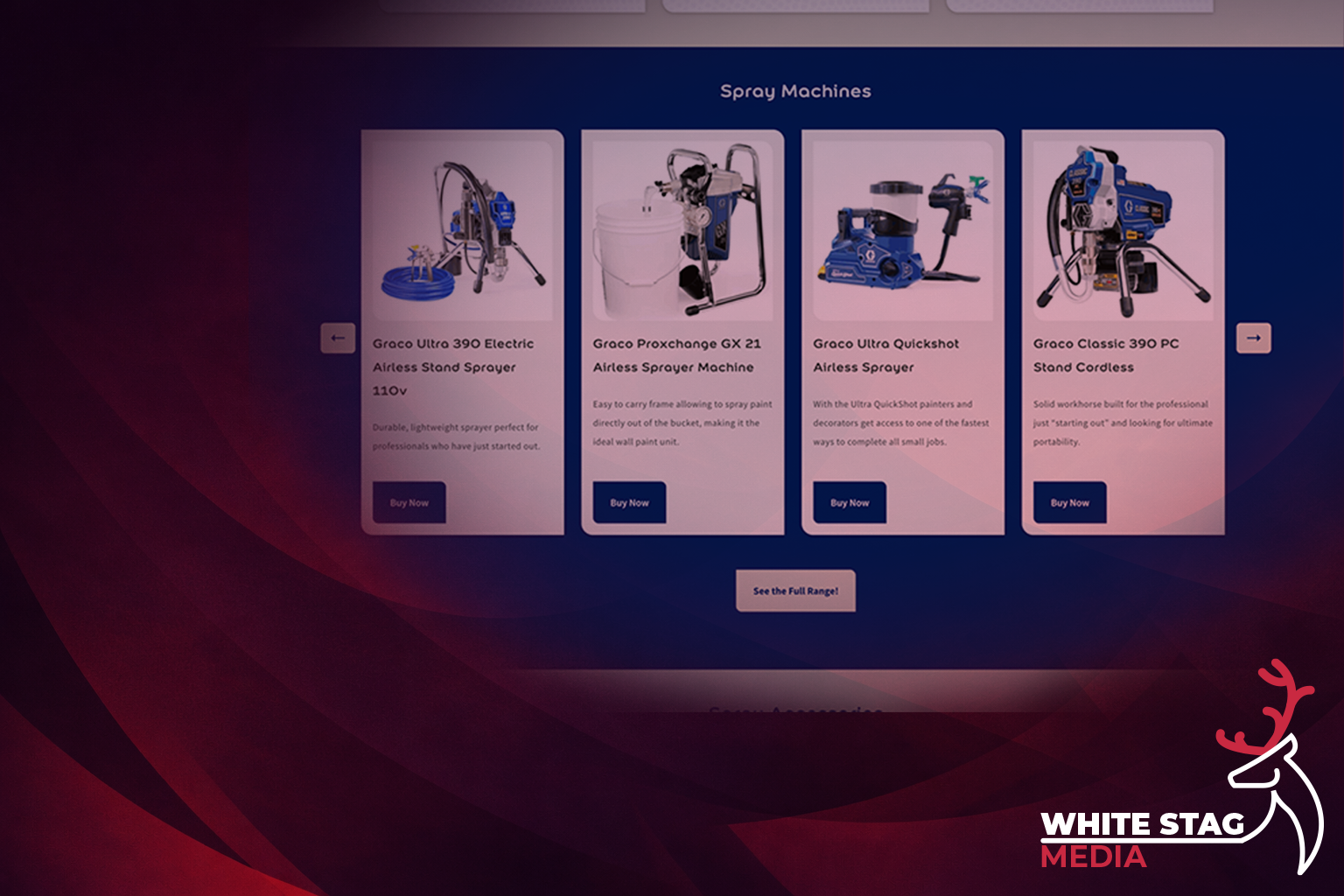
If your category page has more than ~25 products, add a 3–6 option “Start here” layer above the grid. It’s one of the quickest conversion wins you can make.
There’s a myth in ecommerce that more products on the page = better.
In reality, the more you ask someone to scan, the more likely they are to do nothing.
A better approach is progressive disclosure:
This is basically how good sales assistants work:
Practical tip:
If your category page is an endless scroll, try reducing the first product block to a “best of” section and put the full range behind a single obvious next step.
Technical products create comparison behaviour.
People click five products, open five tabs, lose track of what they’ve read, and quietly leave.
If you want users to stay on your site, you need to provide decision-support — not endless spec dumps, just enough guidance to help them self-select.
That can be:
The goal is to reduce uncertainty.
Practical tip:
Add a short “Which one do I need?” section. Even if it’s basic, it stops people getting stuck — and getting stuck is what kills conversion.\
This is underrated.
On technical category pages, users usually fall into two groups:
If your page only serves ready-now buyers, you’ll lose the confidence buyers.
That’s why education content placed under the shopping journey works so well:
It doesn’t interrupt the purchase path — it’s there when they need it.
Practical tip:
Top of page = action. Lower down = reassurance.
Put education below the product journey, not above it.
This is the principle that ties everything together.
A good category page supports two modes:
Most pages underperform because they mix these together:
The best pages layer them.
If you’re looking at your category page and thinking “why isn’t this converting?”, run this:
If you improve those five areas, the page becomes easier to shop — and easier pages convert.
For technical e-commerce, structure beats polish.
Great hierarchy and flow will outperform “prettier design” every time, because it reduces friction and uncertainty — the two things that silently drain conversions.
Want an affordable, modern website that actually works?
Let’s chat — no pressure, no jargon.
https://www.whitestagmedia.co.uk/contact