How do you take an established campaign, create something new from it and still make every touchpoint feel connected?

Extend an established campaign into a new digital environment without simply reproducing the original creative.
Identify what made the existing campaign recognisable, then develop that visual language around the needs of each Dulux Decorator Centre digital touchpoint.
Consistency doesn’t require everything to look identical. It requires everything to feel connected.
Good design doesn’t always start with a blank canvas.
Sometimes the challenge is working with something that already exists and deciding what should stay, what needs to change and what needs to be created from scratch. That was one of the main challenges that I faced when I worked on the digital experience for the launch of Dulux Trade Durable Kitchen & Bathroom Eggshell at Dulux Decorator Centre. The wider Dulux Trade campaign already had an established identity. Product photography, deep blue backgrounds, bright yellow accents, bubbles, foam and the yellow duck created a distinctive visual language across other campaign touchpoints. My role was to take that existing language and translate it into something that was designed specifically for the Dulux Decorator Centre website.Not simply reproduce it. The objective was to make the digital experience feel unmistakably connected to the wider campaign while giving it an identity and experience more suited to how users interact with a website.That distinction shaped almost every decision that followed.

Brand consistency is sometimes interpreted as repeating the same design everywhere.
It doesn’t need to be.
A customer might encounter a campaign through advertising, in-store material, social media, a homepage, promotional tile or landing page.
Those formats have completely different requirements.
What should remain consistent is the idea behind them.
For this project, the existing Dulux Trade campaign gave me a visual vocabulary to work with. The product, colour palette, bubbles, foam and duck were already recognisable parts of the launch.
The question was what to do with them next.
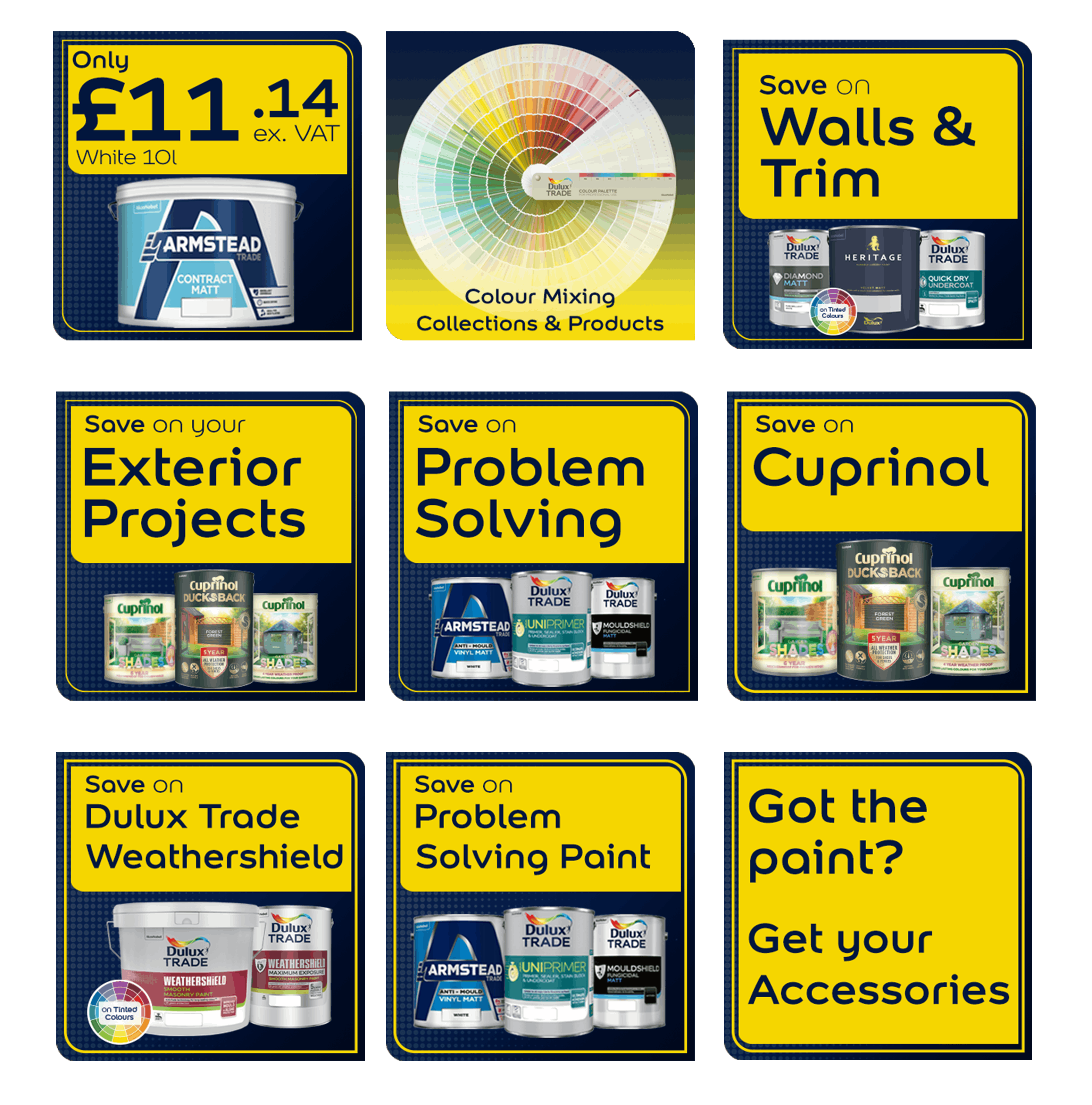
For Dulux Decorator Centre I developed that language across:
Each component had a different job.
Making them identical would have limited what each could do. Making them too different would have weakened the connection to the wider launch.
The design problem was finding the space between those two extremes.

This was probably the most interesting part of the project for me.
When good campaign assets already exist, it’s tempting to treat them as templates.
Take the original creative. Rearrange it slightly. Resize it. Put it online.
The result might technically be on-brand, but it doesn’t necessarily make good use of the new environment.
Instead, I treated the supplied campaign material as a set of ingredients.
Some elements could be used directly. Others could be adapted. New elements could then be designed around them.
The bubbles, for example, became much more than decoration from a static campaign asset once they entered a digital environment.
They could move.
The foam could become part of the structure of a composition.
The duck could act as a recurring visual anchor.
The established blue and yellow palette could connect new interface components to the wider campaign without requiring every component to share the same layout.
That gave me room to create something new while maintaining the visual relationship customers would already recognise elsewhere.
Use existing brand assets as ingredients, not instructions.
A point-of-sale display doesn’t behave like a website.
Neither does a television advert, social post or homepage banner.
Every format has its own constraints, and simply transferring a design from one to another ignores how people actually interact with it.
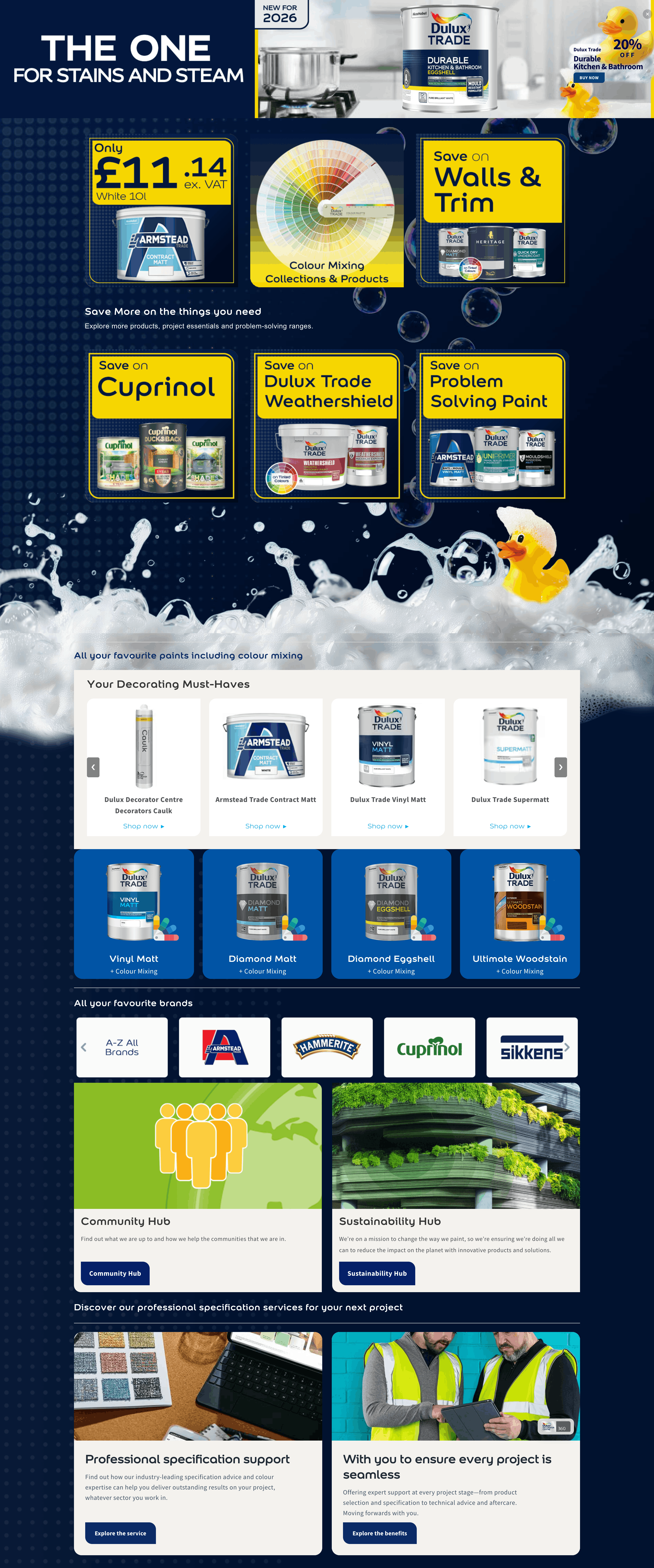
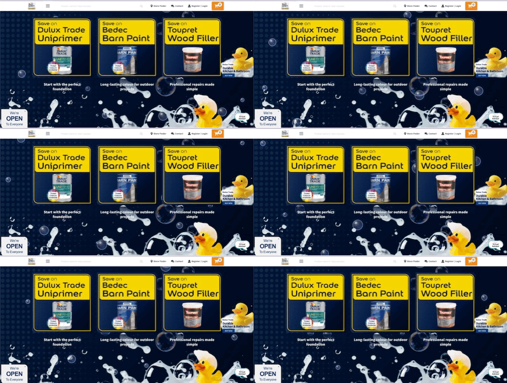
On the Dulux Decorator Centre homepage, the campaign needed immediate impact.
Someone might only see it briefly before moving elsewhere on the site, so the product and campaign identity needed to register quickly.
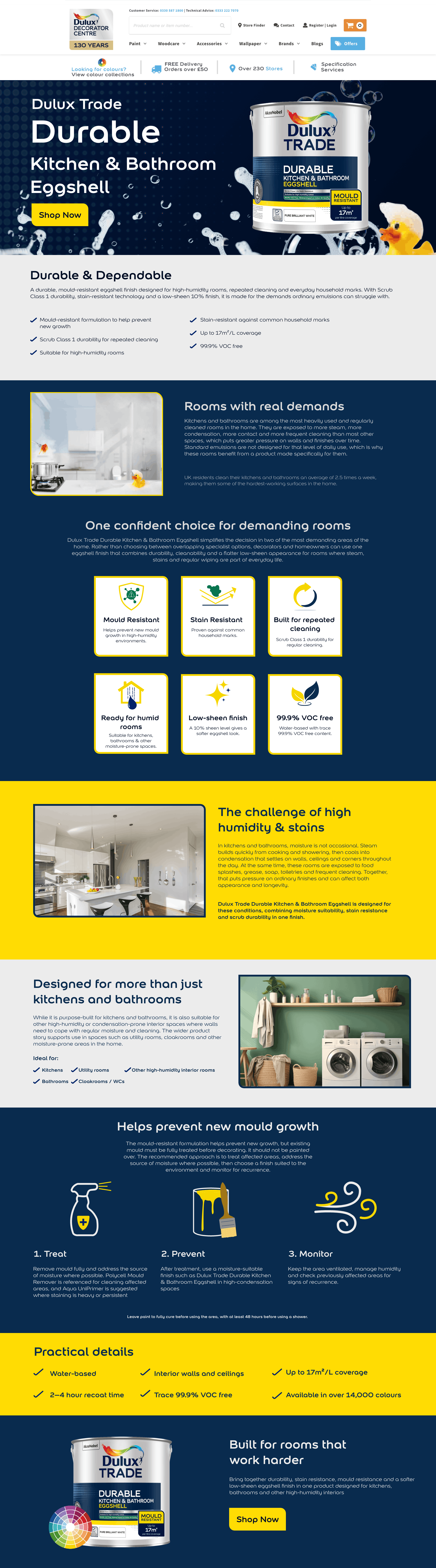
Once somebody reached a landing page, the problem changed.
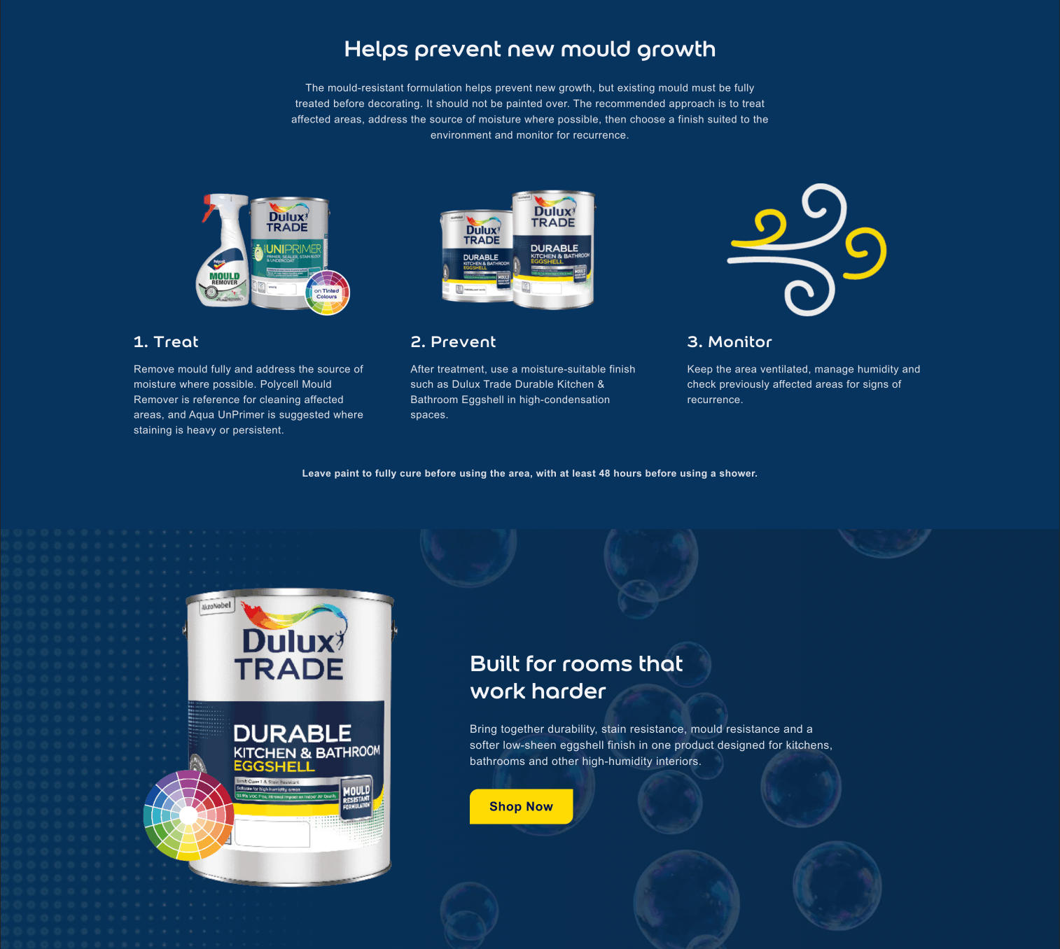
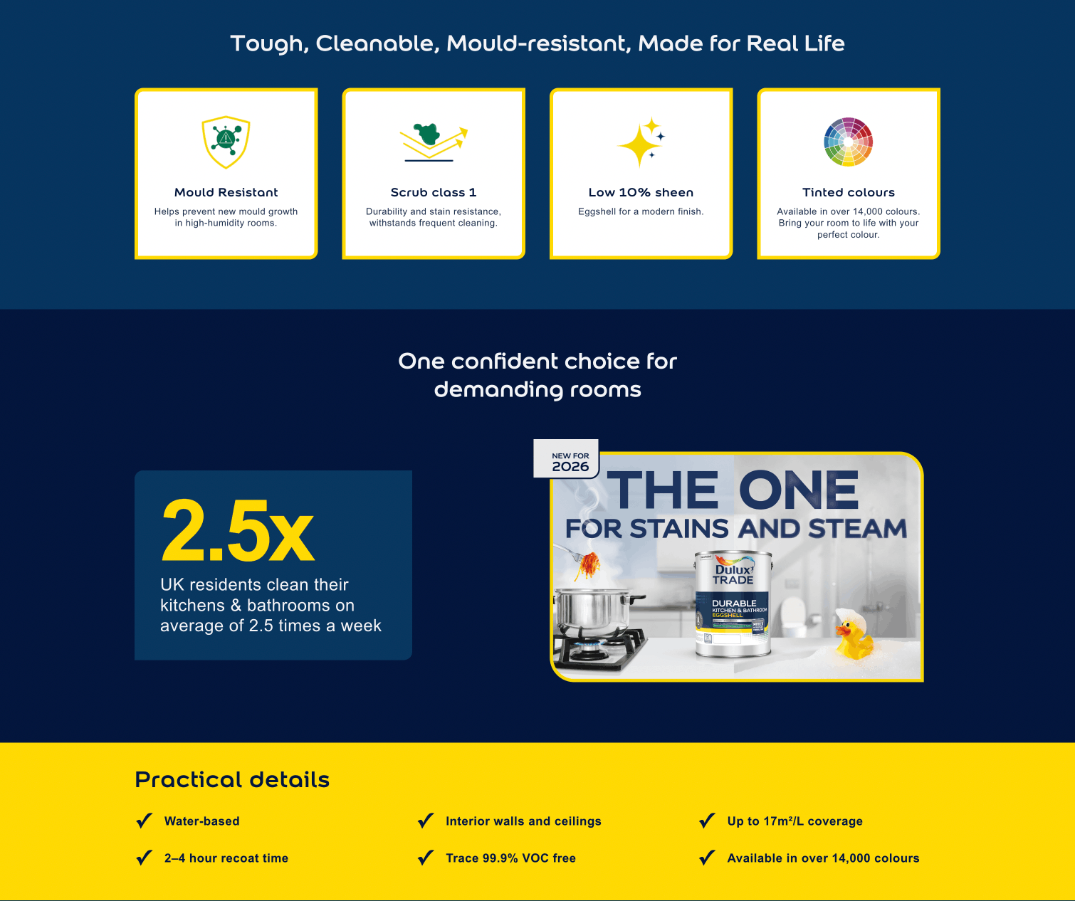
Now there was more space to explain what the product was, communicate its benefits and give people reasons to continue towards a purchase or find out more.
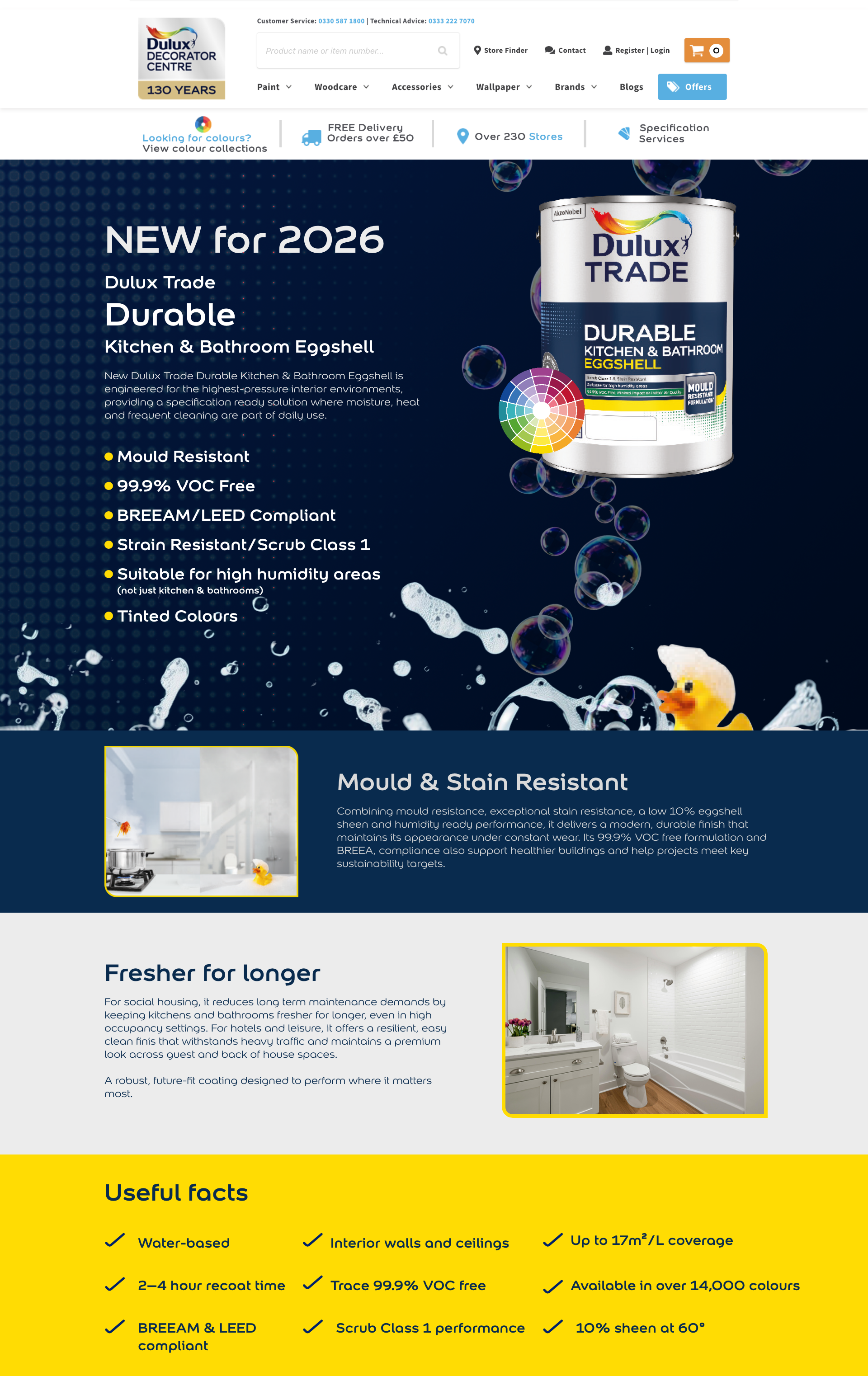
The specifier audience introduced another requirement again.
The same product needed to sit within an experience that could communicate more technical information without losing the campaign identity established elsewhere.
Good campaign design therefore wasn’t about finding one layout and reproducing it at different sizes.
It was about designing different solutions that still felt related.
One of the biggest lessons this project reinforced was that users don’t experience digital campaigns as individual design files.
They experience the journey between them.
Someone can encounter the campaign on the homepage, interact with a promotional element, move onto a landing page and eventually continue towards a product.
They shouldn’t need to stop at each stage and work out whether they’re still looking at the same campaign.
That recognition should be almost immediate.
Colour helps.
Typography helps.
Imagery helps.
Repeated visual motifs help.
But consistency also comes from hierarchy, behaviour and the way information is presented.
When those elements work together, separate pages begin to feel like parts of one experience rather than a collection of marketing assets.
And ideally, the customer doesn’t consciously notice any of that.
They just understand where they are.
Working digitally gave me opportunities that didn’t exist within the original static campaign material.
But having the ability to animate something doesn’t mean everything should move.
I used animated bubbles across parts of the experience and introduced subtle lift effects when users interact with promotional tiles.
That’s deliberately about as far as it goes.
The movement adds some character and helps bring the campaign language into a digital environment, but it doesn’t compete with the product or the information around it.
Adding more animation would have been easy.
It wouldn’t necessarily have made the experience better.
That’s something I think applies to digital design generally.
Motion works best when it supports what somebody is already trying to understand.
A hover state can confirm that something is interactive.
Subtle movement can draw attention.
Animation can reinforce the personality of a campaign.
But once users start watching the interface instead of understanding the message, the design is working against itself.
Sometimes a few moving bubbles are enough.

This is one of the misconceptions about design that I think is worth addressing.
A finished website can look simple.
There might be a product image, some copy, a handful of icons and a button.
It can therefore be easy to assume that not much design work was required.
Usually, the opposite is true.
Before something becomes simple for the person using it, somebody has to decide:
This project had plenty of them.
There was an existing Dulux Trade campaign identity.
There was an established Dulux Decorator Centre website and ecommerce environment.
There were different audiences.
There were technical limitations.
And there were internal stakeholders whose requirements and feedback needed to be considered throughout the project.
None of those things prevented creativity.
They gave it direction.
Working with stakeholders was particularly important because design decisions don’t exist in isolation. Brand requirements, product priorities, commercial requirements, technical feasibility and customer needs all have to meet somewhere.
The designer’s job isn’t simply to produce the most visually interesting answer.
It’s to find the strongest answer within those requirements.
For this project, the question repeatedly became:
How far can I push this while it still feels unquestionably part of the same campaign?
That was a much more interesting problem than starting with nothing.
My involvement didn’t stop once the visual designs were approved.
For the Dulux Decorator Centre execution, my role covered digital design, UI/UX, campaign asset adaptation, creation of supporting graphics and icons, responsive design, front-end development and implementation.
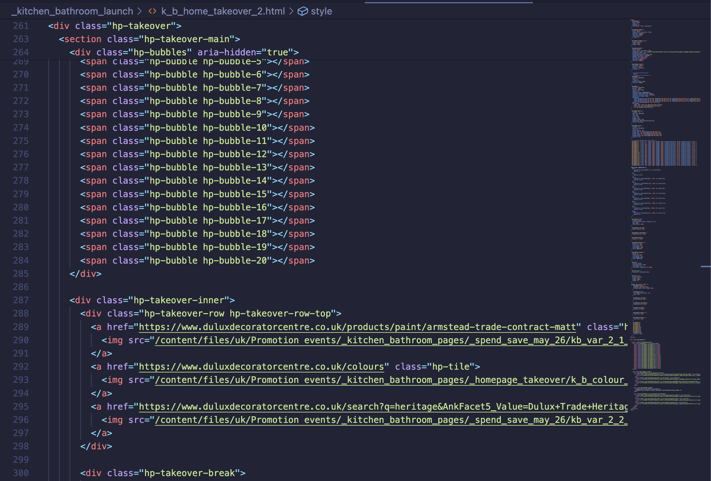
I worked primarily across Photoshop and Illustrator for the visual assets, then HTML, CSS and JavaScript for the front-end experience, implementing the finished work within the Dulux Decorator Centre Sana Commerce 9.2 environment.
Being involved in both sides of the process changes how I approach design.
I can think about how something will behave while I’m deciding how it should look.
A hover interaction isn’t an instruction handed to somebody later.
Responsive behaviour isn’t something considered once the desktop design is finished.
And animation isn’t an effect added because there’s some empty space left to fill.
They’re parts of the same design problem.
That helps close the gap between the original idea and what customers eventually experience.
When all of those decisions come together, the final result shouldn’t necessarily look complicated.
In fact, I think the opposite is usually preferable.
The Kitchen & Bathroom campaign ultimately needed to do something quite straightforward.
That helps close the gap between the original idea and what customers eventually experience.
Everything else exists to make those things easier.
The campaign identity provides recognition. The page structure provides hierarchy. The icons make information easier to scan. The animation adds character. The interactions provide feedback. The responsive design makes the experience work across devices.
None of those things should become more important than the message itself.
The finished Dulux Decorator Centre campaign has been positively received during the launch, but the part I find most useful from a design perspective is what the project demonstrates about consistency.
Consistency doesn’t mean making everything identical.
It means creating enough connection between different experiences that they feel like parts of the same thought.
The original Dulux Trade campaign gave me a strong visual language to work from.
My job was to understand that language, decide what made it recognisable and then extend it into a digital environment with its own requirements.
The homepage takeover, tiles, widget, landing pages, icons, interactions and supporting assets aren’t copies of the original campaign material.
They’re an extension of it.
And that’s ultimately what I wanted the finished experience to feel like.
Not something added onto the campaign afterwards.
Something that had always belonged to it.
You don’t need to be launching a national product campaign for the same principle to matter.
A customer might discover your business through Google, visit your website, look at your social media, read a brochure, receive a quote and eventually see your branding on a vehicle or uniform.
To you, those might be separate things created at different times.
To the customer, they’re all your business.
If each touchpoint looks, sounds and behaves as though it belongs to a different company, you’re asking the customer to make the connection themselves.
Good design makes that connection easier.
It creates recognition.
It reduces uncertainty.
And it makes the business behind those individual touchpoints easier to understand and remember.
That’s why consistency has value beyond simply making things look good.
One limitation of showing digital work in a portfolio is that a screenshot can only show a moment.
It can’t show how a tile responds when somebody interacts with it. It can’t show bubbles moving through the page. And it can’t completely recreate the journey from the homepage into the wider campaign.
The Kitchen & Bathroom campaign is still currently live on the Dulux Decorator Centre website, so for the moment the full experience can still be viewed as it was designed to be used.
Client / Organisation
Dulux Decorator Centre
Project
Dulux Trade Durable Kitchen & Bathroom Eggshell launch
My role
Digital Design · UI/UX · Front-end Development · Campaign Adaptation · Iconography
Platform
Sana Commerce 9.2
Lessons from Live Projects looks at the thinking behind real design and development work.
Not just what the finished project looks like, but the problem it needs to solve, the constraints around it, the decisions made along the way and the lessons that can be applied elsewhere.