If the site doesn’t answer those quickly, the visitor doesn’t keep exploring, they leave. And it’s rarely because the service is bad. It’s because the website makes the visitor work too hard, too early. This post is about structuring a service website so the next step feels obvious and the enquiry feels easy.
When someone wants a service (electrician, roofer, window cleaner, builder, etc.), they’re not “shopping for fun”.
They’re trying to reduce risk.
That means their behaviour is predictable:
Most people don’t read websites line-by-line, they scan in patterns and pick out what feels relevant.
That’s why structure matters more than clever copy.
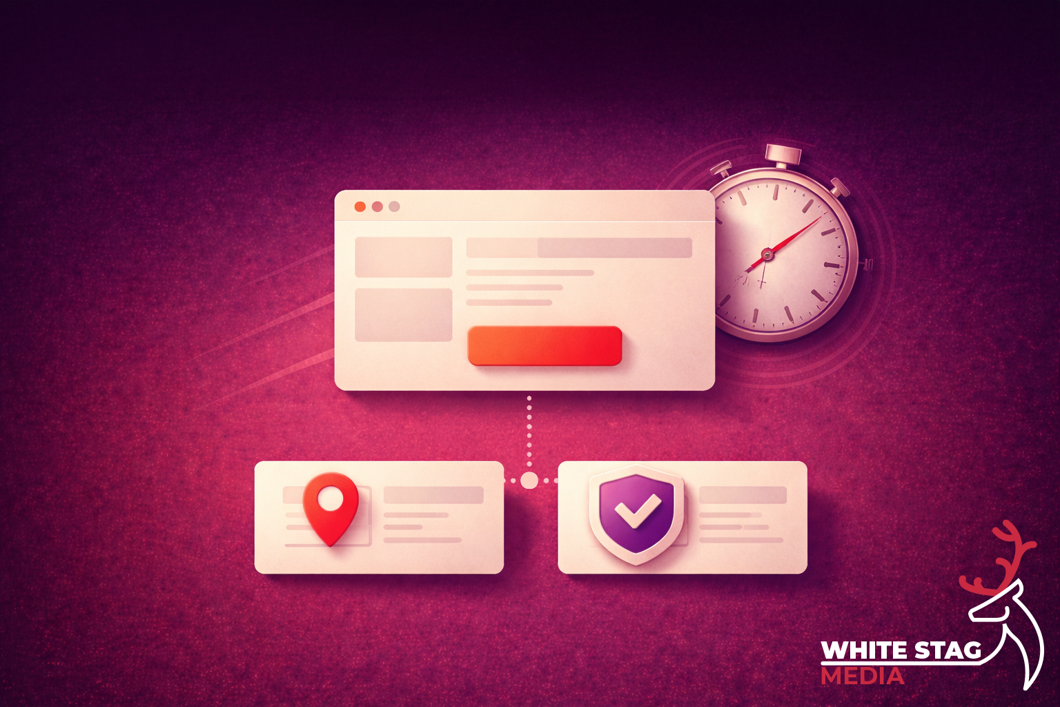
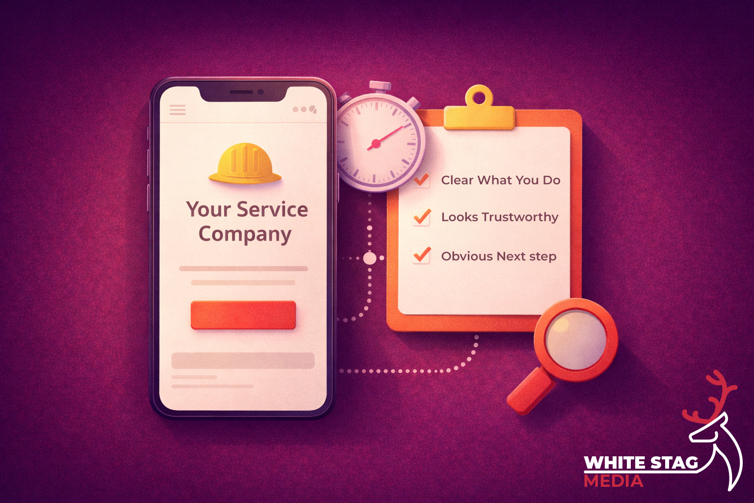
Your first screen (especially on mobile) should do three jobs in order:
1) Confirm fit
Say what you do, who it’s for, and where you do it (service area).
2) Reduce risk
Show proof early - reviews, accreditations, years trading, recognisable logos, real photos.
3) Make the next step effortless
One clear CTA: call / WhatsApp / quick form / “get a quote”.
If you bury any of these, you force the visitor into detective mode. And detective mode doesn’t convert.
On service sites, trust isn’t a “nice to have”. It’s the product.
You’re not just selling the job — you’re selling reliability, safety, and the feeling that you’ll turn up and do it properly. The fastest way to communicate that is to put credibility near the action, not tucked away on an “About” page.
That can look like:
The aim is simple: reduce uncertainty before you ask for commitment.
Most small business forms are built like paperwork: long, awkward, and demanding.
But a form is a decision moment. You’re asking someone to hand over personal details and trust you’ll respond. So the form should feel lightweight.
Two principles help here:
Ask only what you need to respond. Name + contact + a single “What do you need help with?” field will outperform a form that feels like a questionnaire, especially on mobile.
If you need more detail, collect it in steps after the first commitment. This is a well-established usability approach: show the essentials first, then reveal more when the user is ready.
Also: labels should be clear and persistent. Don’t rely on placeholder text as your only instruction.
If your page loads slowly, users don’t wait. They assume the experience will be painful and they leave.
Google’s research highlights how bounce likelihood rises as load time increases (the “new industry benchmarks for mobile page speed”).
You don’t need to obsess over perfect scores, just remove obvious blockers:
Speed is credibility.
If you want local leads, don’t just mention the town once in a footer.
Service-area clarity works because it answers a big fear fast: “Are you actually near me?”
A simple pattern that works well:
This isn’t about keyword stuffing. It’s about reassurance.
This is one of the quickest lead wins because it removes uncertainty.
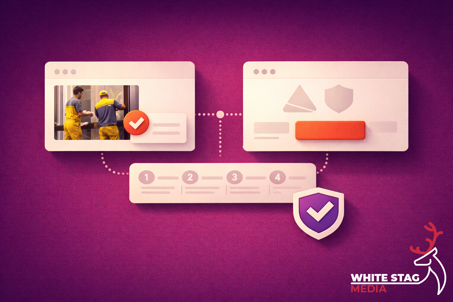
Right after your Call To Action, add a short section:
What happens next
It makes the process feel safe and structured — like dealing with a professional, not taking a punt.
I’ll keep this short — because you’ll recognise them instantly:
Most of these aren’t design problems. They’re sequence problems.
Open your homepage on your phone. Don’t scroll.
Ask yourself:
If any answer is “not really”, you’ve found your next UX win.
Google can’t rank what people don’t understand. A lead-ready structure improves engagement signals (less bouncing, more clicks, more enquiries),
but more importantly it improves clarity and clarity is what makes both users and search engines understand what the page is about. If you want, I can help you apply this to one page and show the “before/after” structure.
Send me your URL and I’ll do a quick “lead-readiness” pass: