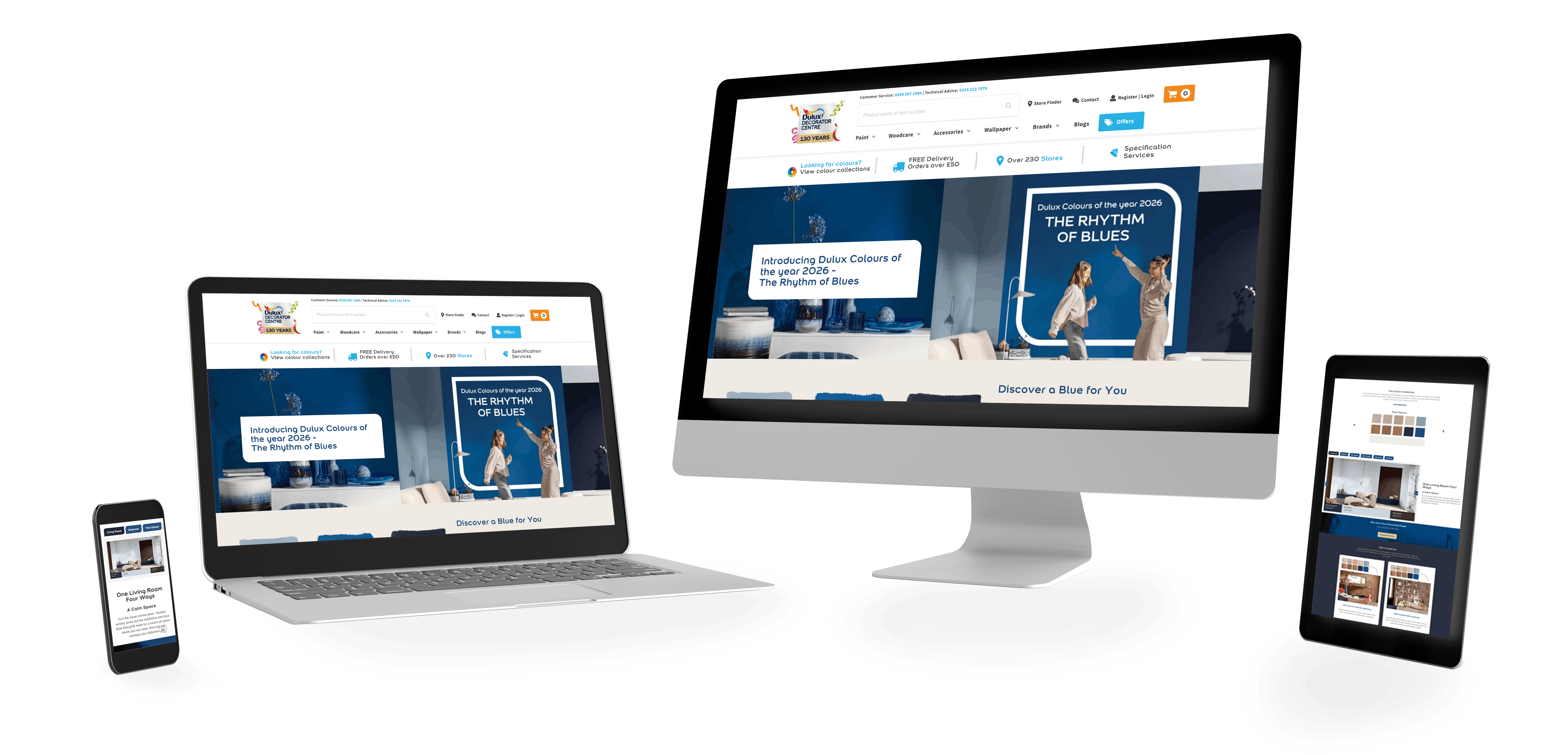
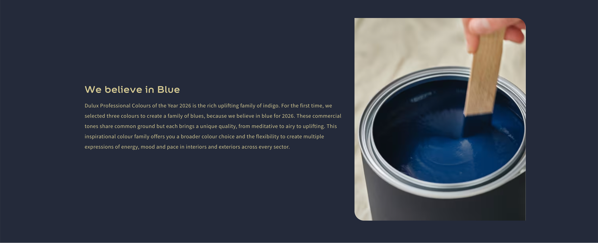
Colours of the Year pages are a weird mix: they need to feel like a campaign, but they still have to function like a tool. People aren’t just browsing for fun they’re trying to picture a space, compare options, and make a call. For COTY26, the key was building a page that feels calm and premium, while still doing the hard work in the background: guiding users to a palette, showing it in context, and giving them a clear “next step” when they’re ready.
This build needed to do two jobs at once:
tell the COTY story and make it easy to actually use the colours.
The consumer page leans into inspiration and exploration.
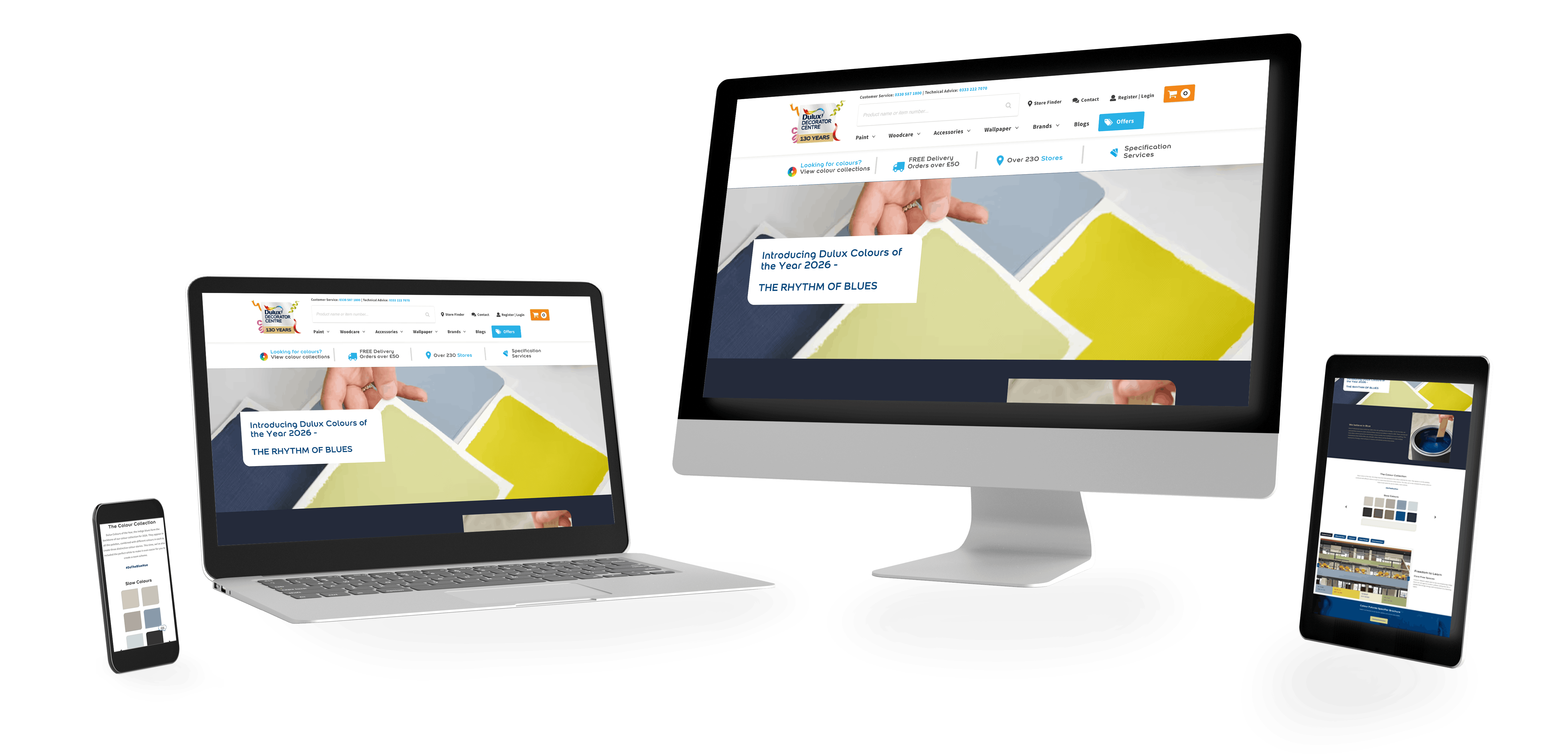
The specifier page is more direct, quicker access to palettes, sector examples, and the brochure download, because that audience is usually working to a brief and needs the information fast.
I designed and built both pages end-to-end, working within the campaign style and brand guidelines.
With colour pages, the risk is always the same: either it becomes a glossy poster with no utility, or it turns into a functional tool that feels dead.
This needed to sit in the middle, calm and campaign-led, but still structured like a decision journey. The user shouldn’t have to scroll for ages to find the palette, and they shouldn’t have to “work” just to understand how the colours are meant to be used.
This campaign needed two experiences:
Same campaign, different intent
so the structure changes, but the design language stays consistent.
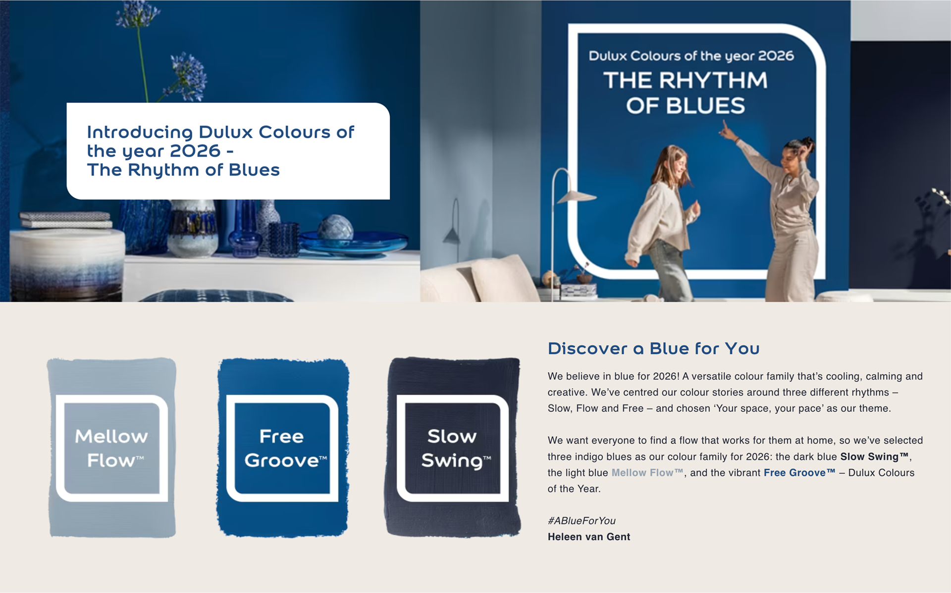
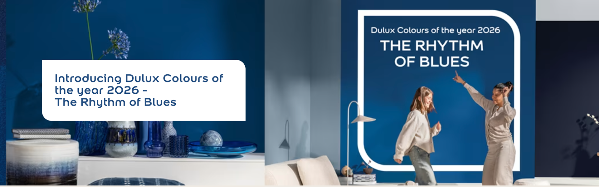
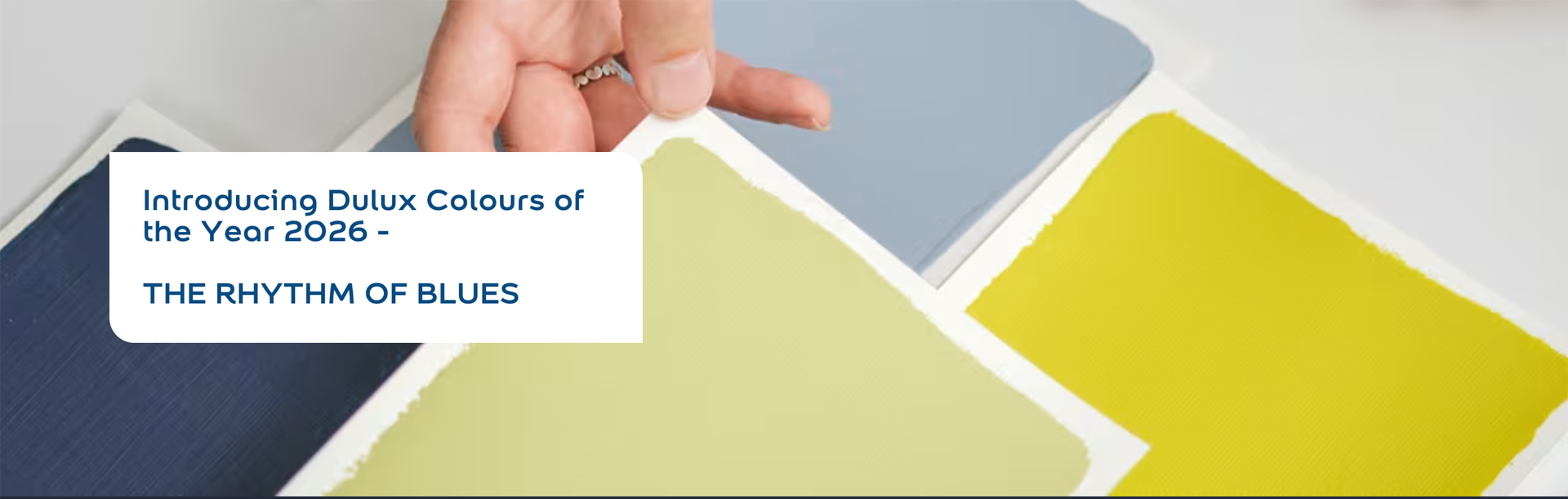
The opening is doing a lot of heavy lifting. It introduces the theme (“Rhythm of Blues”) and immediately gives users a simple way in, rather than dumping them into content.
The “Discover a blue for you” section works because it isn’t shouting. It sets context, then moves users forward. For this kind of page, calm confidence beats hype every time.
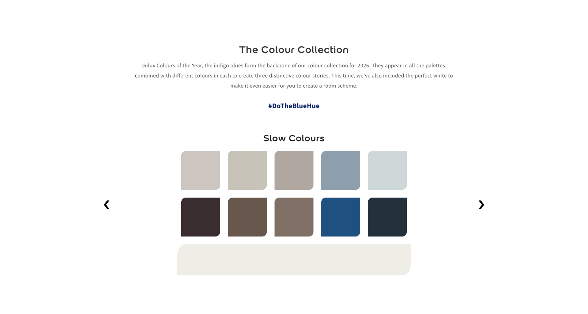
If you want people to actually use colour, the palette has to feel interactive and “selectable”, not just something they read and forget.
So the palette is given space, a clear heading, and a format that encourages comparison at a glance. It’s basically turning colour into a UI component, which is exactly what it needs to be.
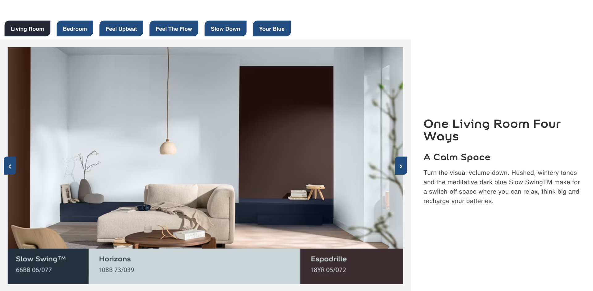
A lot of campaign pages fall over because they either:
This avoids both by giving users “modes”. The tabs/sections act like signposts, you can explore a room set, get the vibe, and still feel like you’re progressing through something structured.
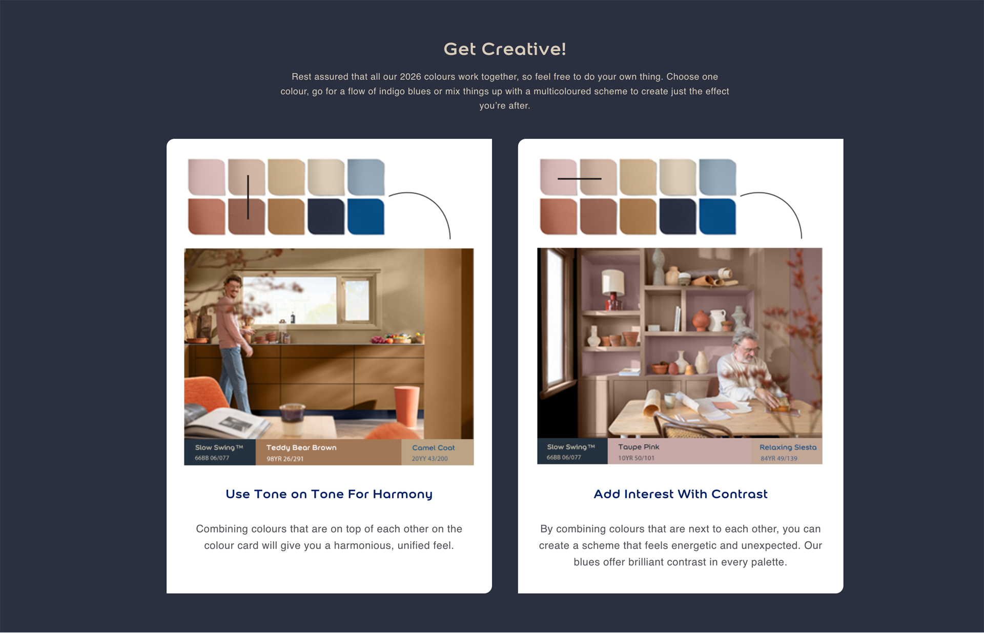
This part is a smart bridge between inspiration and confidence.
Instead of just saying “here are colours”, it shows how to use them (tone-on-tone vs contrast). That’s what helps people move from “I like it” to “I can actually do this in my space”.
It’s basically reassurance, but delivered visually, which is the best kind.
The specifier page intentionally gets to the point quicker. The opening still carries the campaign feel, but the structure is tighter and more functional: palette, examples, brochure.
That audience usually isn’t in “browse mode”
they’re in “choose mode”, so the page respects their time.
The spec page adds context without turning into a wall of text. The layout keeps it balanced: copy sits quietly, imagery supports it, and nothing competes for attention.
This is one of those cases where restraint is the design.
The strongest part of the spec page is the clear “next step”.
You’re not just asking someone to admire the campaign, you’re giving them a practical action: explore examples, then download the brochure when they’re ready.
That’s how these pages should work: inspire first, support second, convert third — without making it feel like a funnel.

The end result is a campaign experience that stays premium, but still behaves like a tool.
Both pages guide users through the same story, but they respect different intent:
That’s the difference between “a nice looking page” and a page that actually does its job.