Axus brand page for Dulux Decorator Centre
- Page build in VSC
- UX structure and layout
- Visual design (within the brief)
- Icon design (Illustrator)
- Asset creation + image optimisation (Photoshop)
- Content layout and hierarchy
Purpose
To help professional decorators:
- Understand what Axus is (and why it’s worth choosing)
- Explore key product ranges quickly (without digging through the site)
- Build confidence through clear benefits and proof
- Move from “browsing” to “ready to buy” with minimal friction
The challenge
Brand pages are easy to get wrong. They often end up as either a “brand story” that looks nice but doesn’t help people shop, or a product dump with no context, which kills confidence.
The challenge here was to create a page that:
- Stays on-brief and fits the Dulux Decorator Centre website styling
- Explains the brand quickly (without paragraphs of waffle)
- Highlights multiple product types (brushes, rollers, workwear) clearly
- Makes the page scannable for trade buyers who are short on time
- Builds trust before asking for the click
The Solution
A brand page that guides decisions
Rather than treating this as a brochure, the page was designed to do two jobs at once:
- Build confidence in the brand
- Give users clear routes into the range
The structure is layered deliberately:
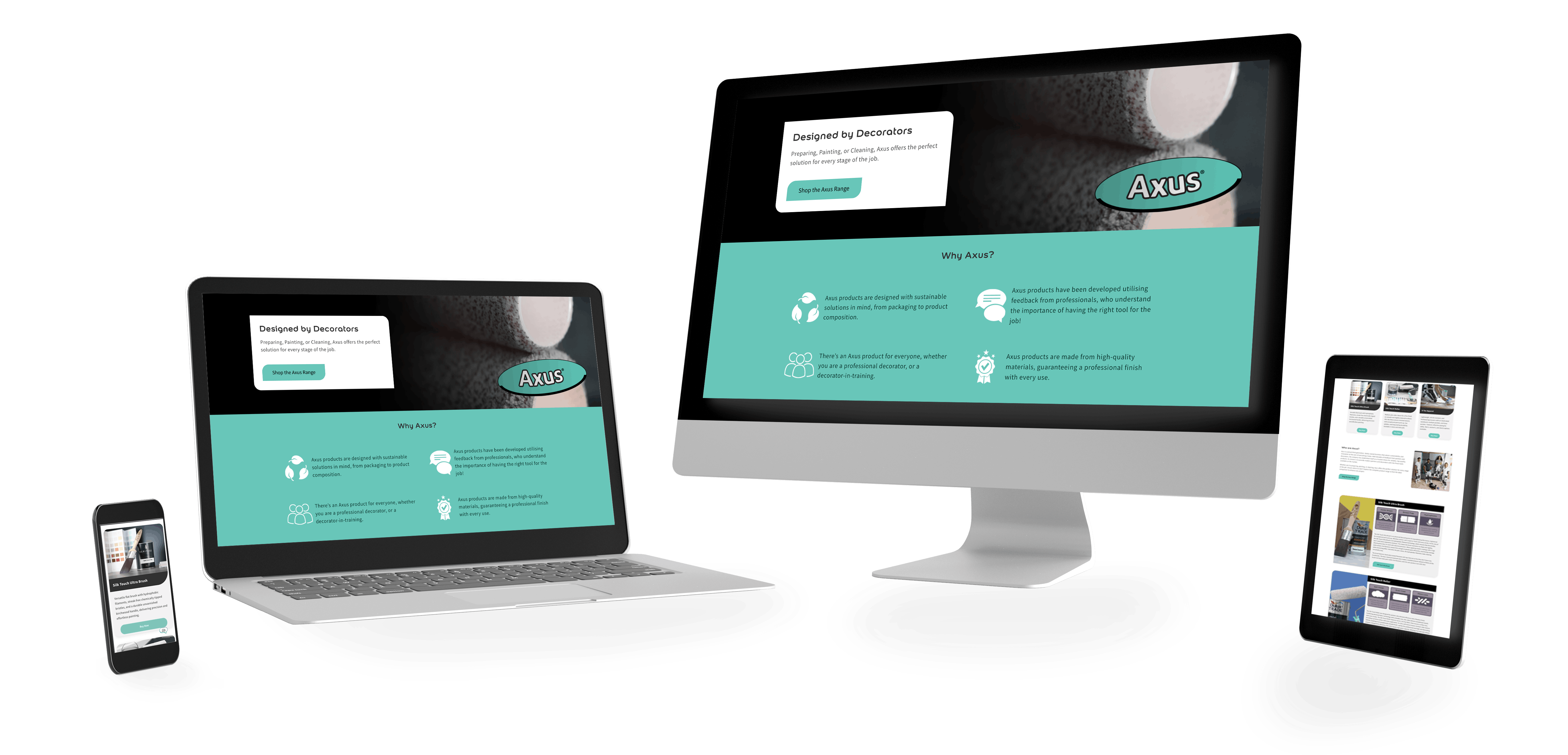
1) Lead with a simple promise + one clear CTA
The “Designed by Decorators” message is straightforward and sets the tone immediately.No clutter, no competing CTAs — just a clean entry point into the range.
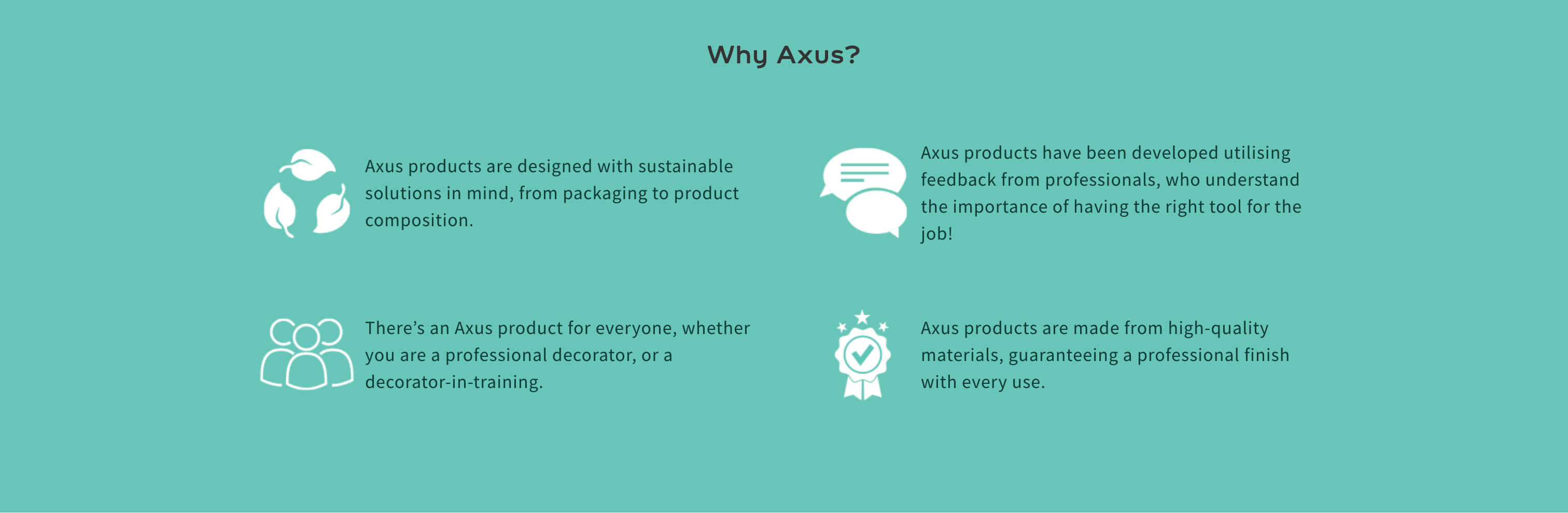
2) “Why Axus?” as a quick trust-builder (not a wall of text)
Instead of a long intro, the page uses short, icon-led reasons-to-believe:
- the value props are clear at a glance
- the icons make it scannable
- the user gets confidence fast, without having to read a full brand story
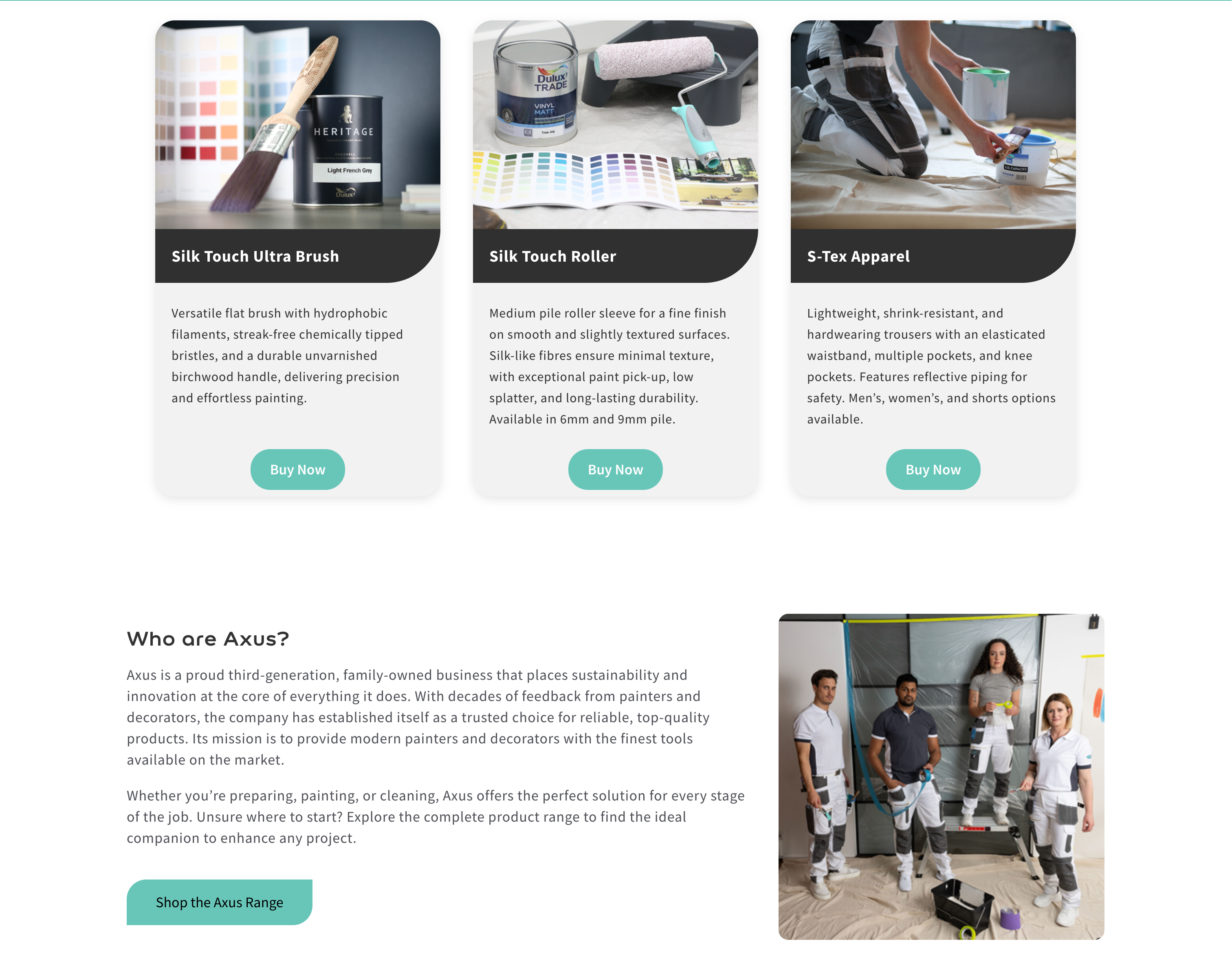
3) Three product routes (fast paths, not endless scrolling)
The product tiles act as “start here” options:
- one look tells you what exists in the range
- one click gets you into the right area
- it removes that initial “where do I even begin?” feeling
4) Brand story placed where it supports the decision
The “Who are Axus?” section sits after the user has already seen product context, which matters.
It means the story supports decision-making rather than delaying it.
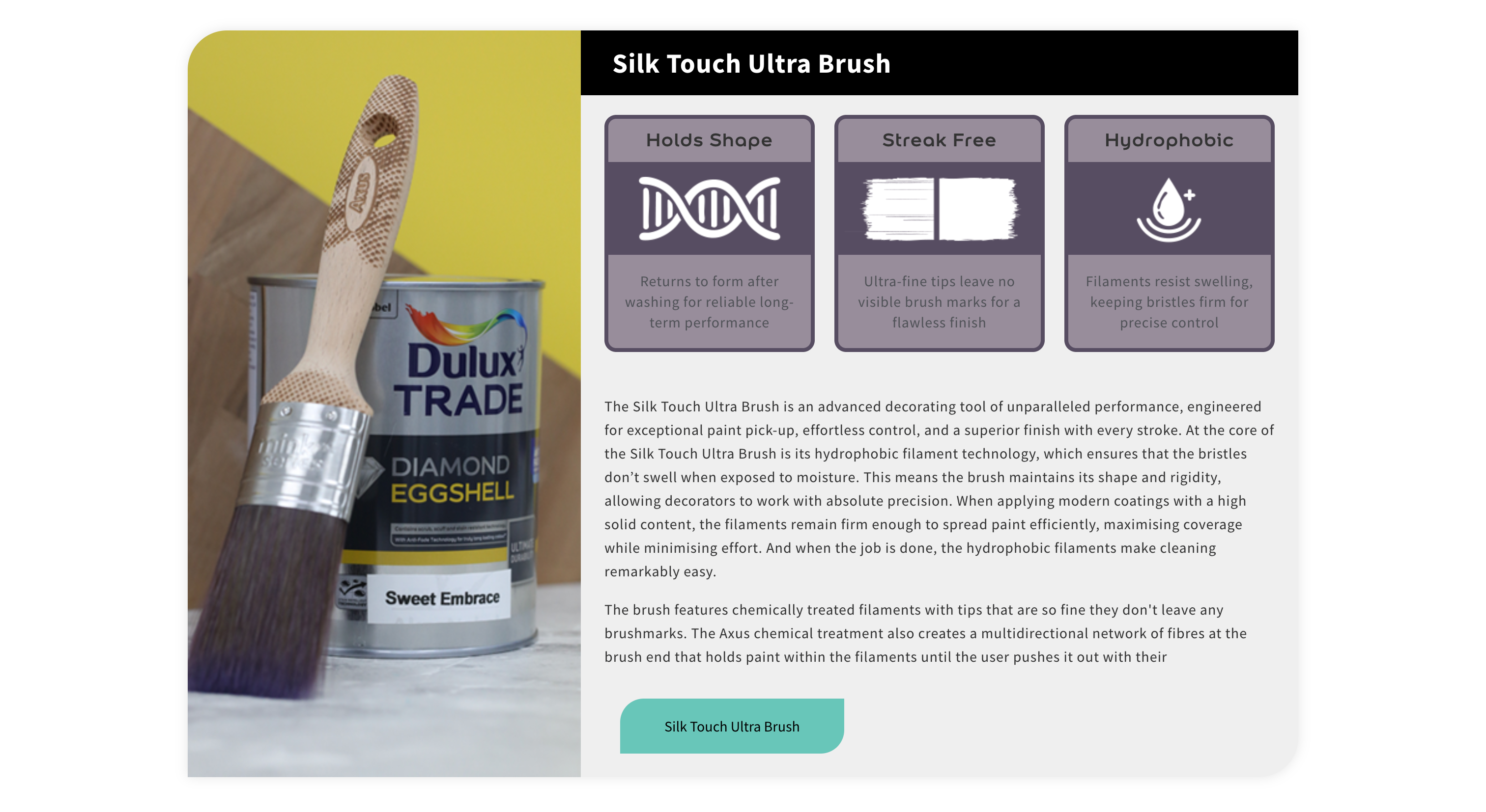
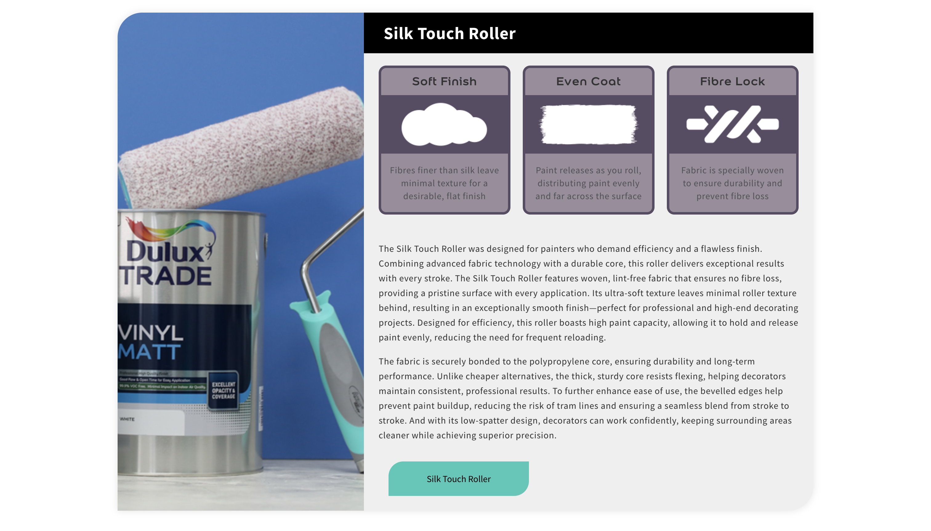
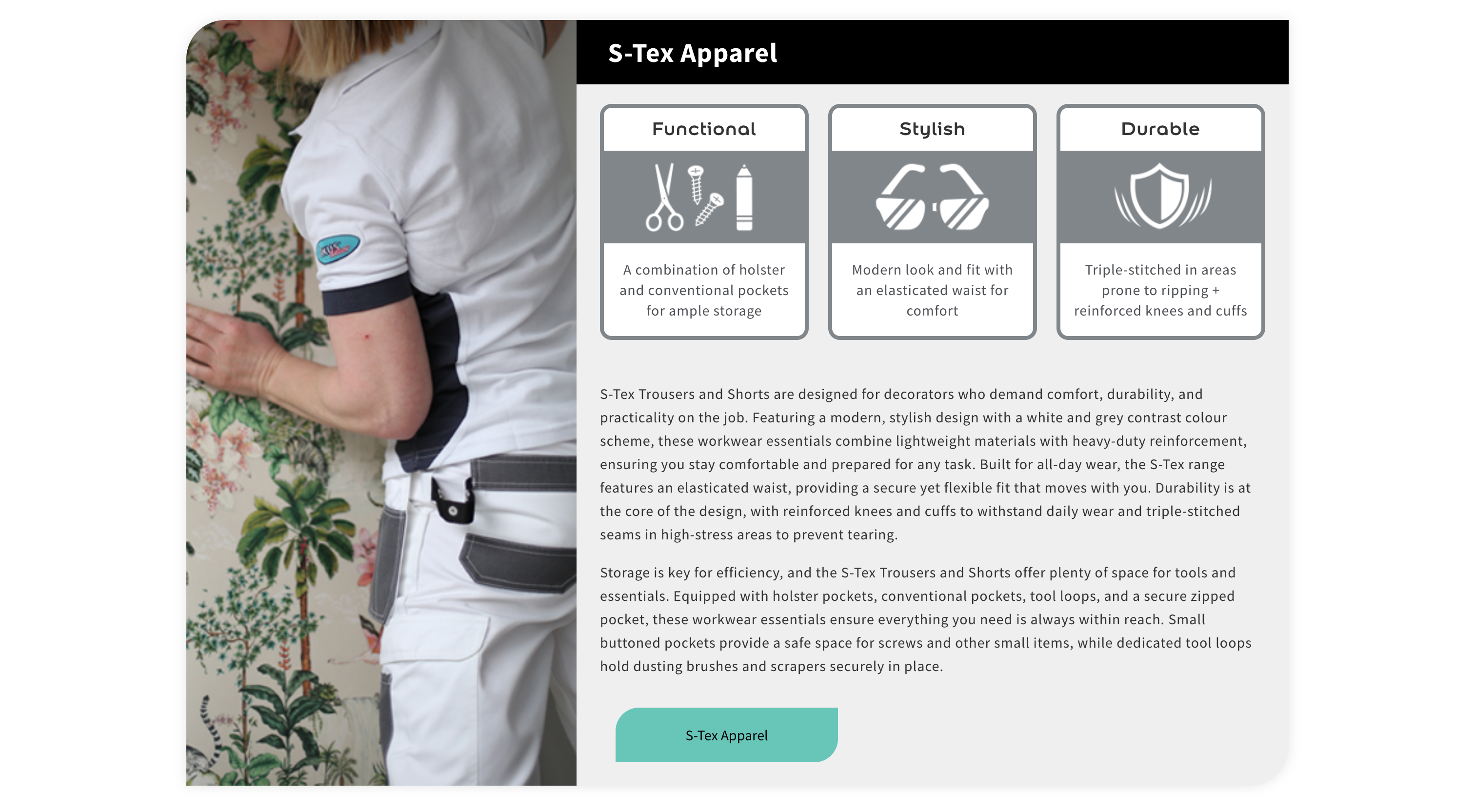
Key feature: Benefit-first product modules
(built for quick scanning)
Lower down the page, the main products get their own feature sections:
- strong visual on the left
- benefits and proof on the right (icon-led)
- a single CTA that doesn’t shout
Why this works:
- Trade users don’t want to read a novel they want reassurance & clarity
- The icons let people scan benefits in seconds
- The deeper text is there for anyone who does want detail
- It feels premium without feeling salesy
Visual hierarchy & page structure
Key design decisions include:
- Strong section separation using colour, spacing, and clear blocks
- A consistent pattern (trust → products → story → deeper modules)
- CTAs that are present but not aggressively repeated
- Clean typography and readable spacing (easy on mobile)
- Product imagery treated consistently so the page feels cohesive
Nothing fights for attention unnecessarily the page is calm, clear, and easy to move through.
Built for trade buyers
(real-world behaviour)
This page is aimed at decorators, and decorators browse differently:
- they scan quickly
- they want the “point” fast
- they need enough confidence to commit
So the page is structured to reduce uncertainty:
- quick trust signals first
- clear product routes next
- deeper proof and detail underneath
That’s how you make a brand page actually useful not just “nice”.
Outcome & strategic impact
The final page delivers a confidence-led browsing journey that’s easy to scan and easy to act on.
Rather than relying on urgency or heavy sales language, the page supports conversion through:
- clearer structure
- better product discoverability
- stronger trust signals
- decision-support through benefit-led modules
It’s also scalable: new products or modules can be added without breaking the layout or turning the page into a mess.
Ready to start something?
If you want campaign creative that’s designed to perform — not just look good — I can help.
Book a Free Consultation