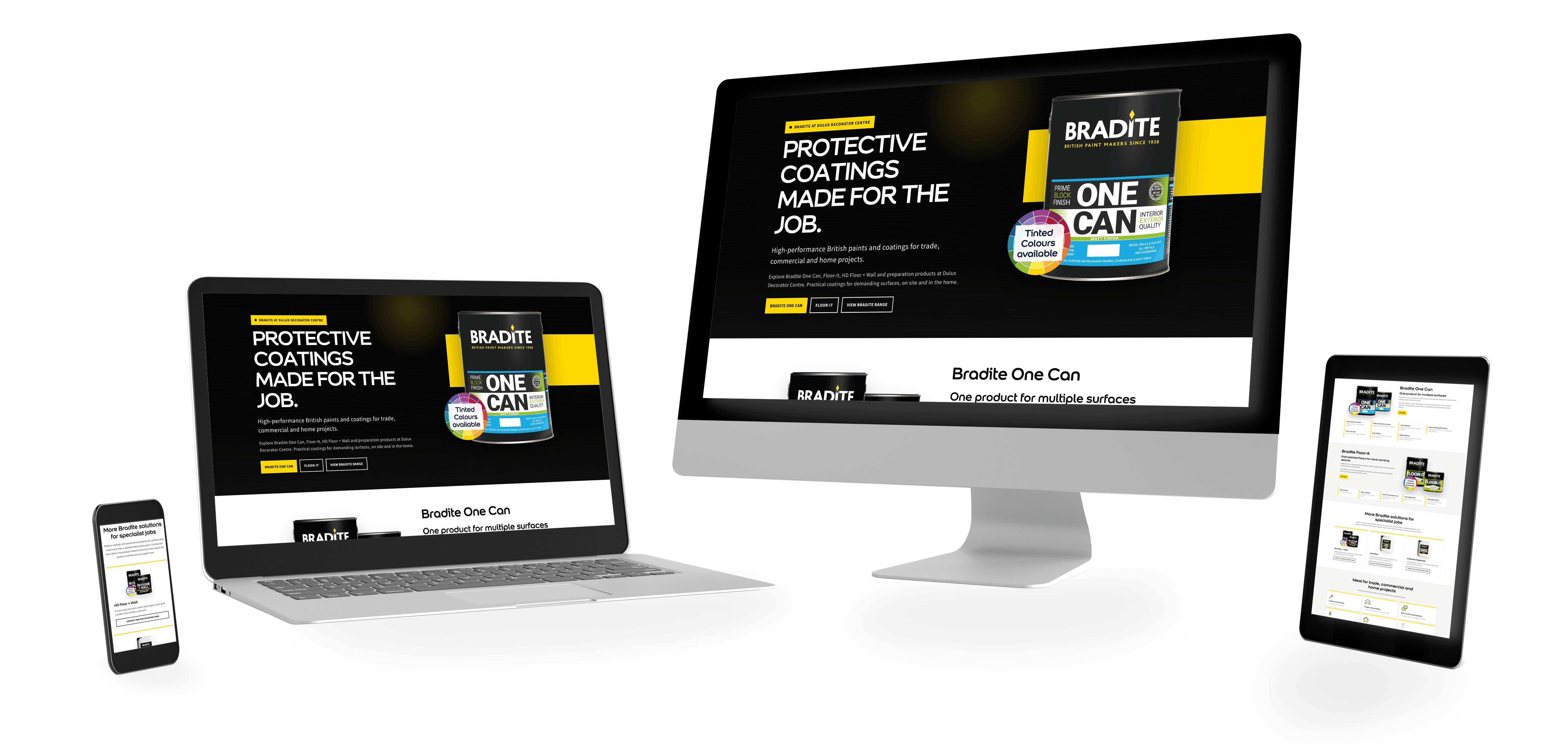
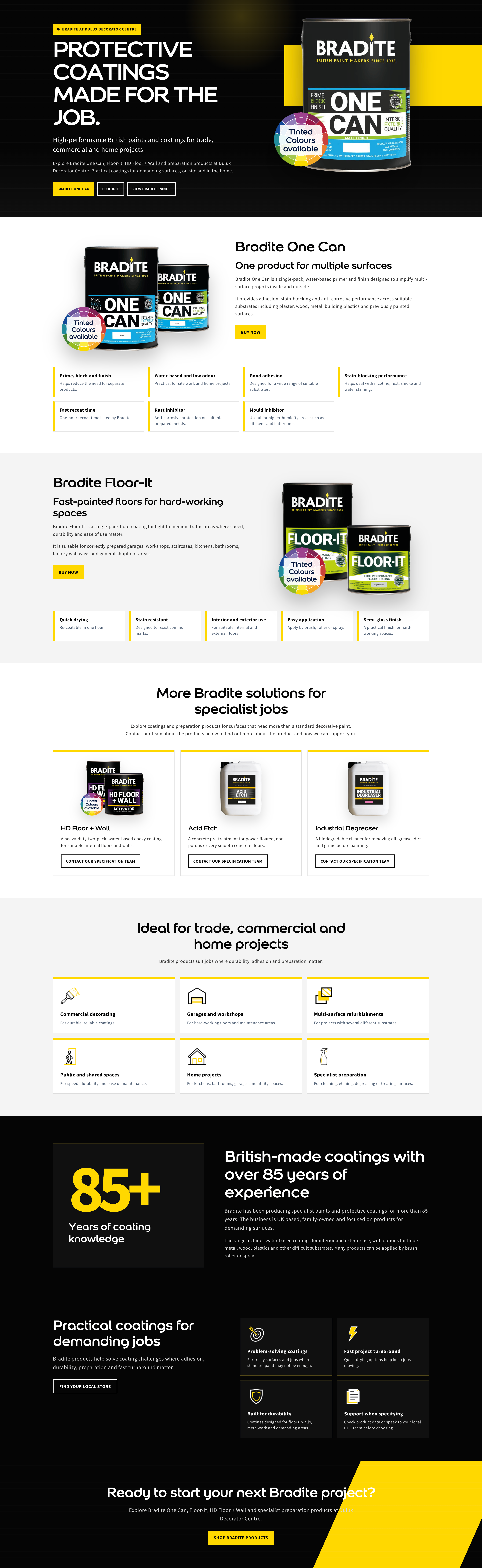
Bradite is a specialist paint manufacturer known for producing high-performance coatings for commercial, industrial and specialist applications. The objective of this project was to redesign the Bradite landing page on the Dulux Decorator Centre website, creating a clearer and more engaging experience that showcased the product range while making it easier for customers to discover key information and navigate to individual products.The final page combines strong visual hierarchy, bespoke iconography and responsive front-end development to create a modern experience that reflects the Bradite brand while remaining consistent with the wider Dulux Decorator Centre website.
The existing page provided an opportunity to better showcase the breadth of the Bradite range while improving the overall user experience.The challenge was to create a page that felt bold and distinctive to the Bradite brand, whilst working within the existing CMS and maintaining consistency with the wider Dulux Decorator Centre platform. The page also needed to communicate technical product information clearly without overwhelming users, balancing commercial objectives with usability and accessibility.
The project focused on several key objectives:
I was responsible for the complete front-end design and development of the landing page, including both the creative direction and technical implementation.
This included:
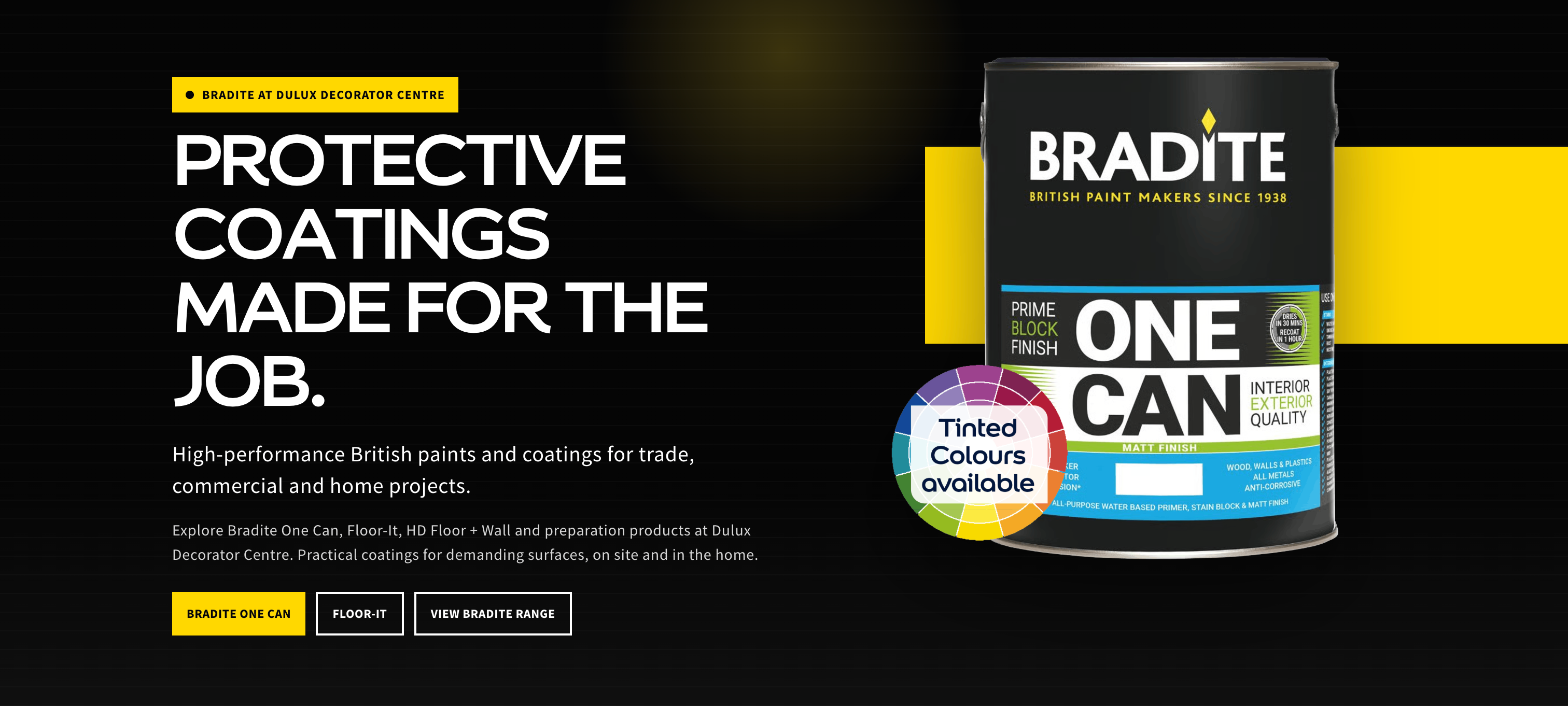
One of the primary goals was to create a page that immediately established Bradite as a specialist coatings brand.Rather than relying on large amounts of text, the design uses clear sectioning, strong product imagery and carefully considered spacing to help visitors quickly understand the range available.Bespoke icons were designed specifically for the project, creating a consistent visual language across the page while supporting key product features and benefits. The overall layout was also designed to guide visitors naturally from the hero section through the product categories and supporting content without unnecessary visual clutter.
Rather than treating the page as a catalogue of individual products, I grouped information around product families and applications. This allowed customers to understand the breadth of the Bradite range first, before moving into the detail of individual products.
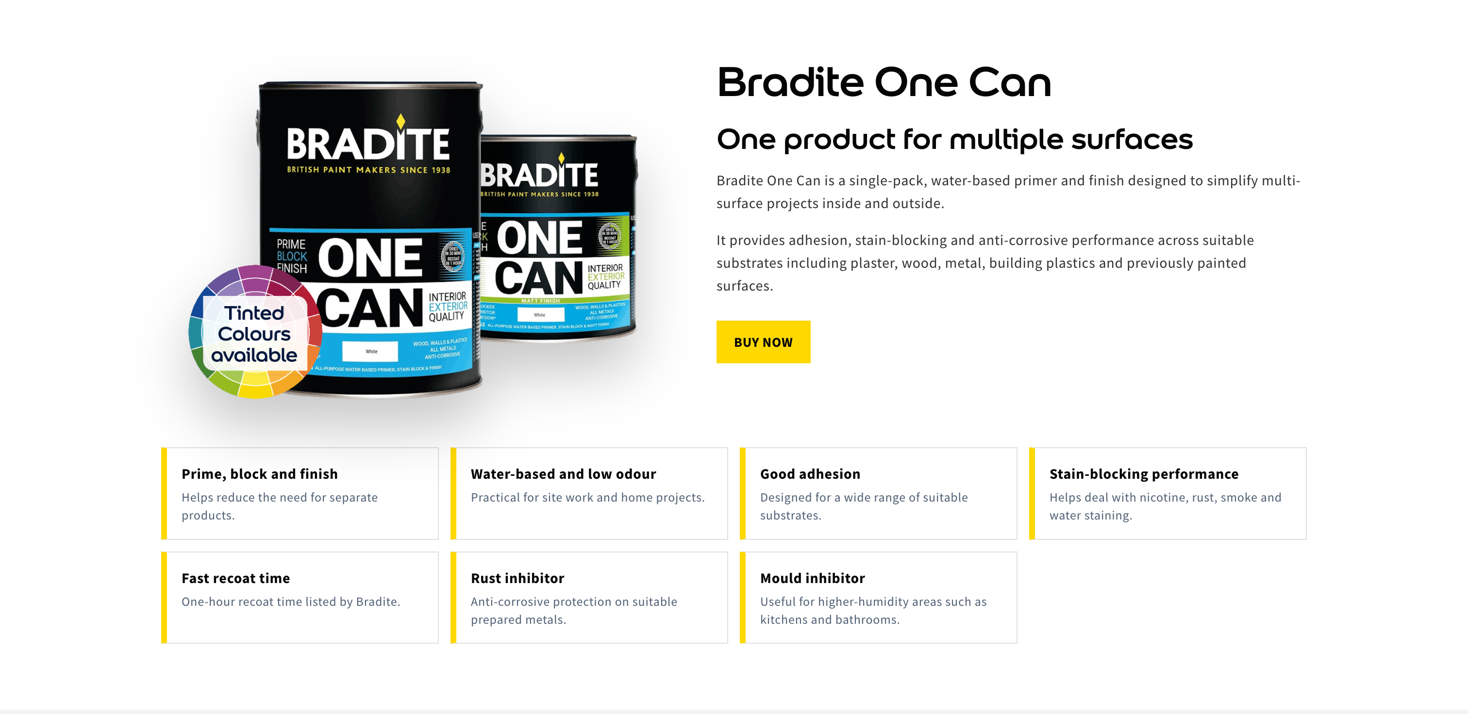
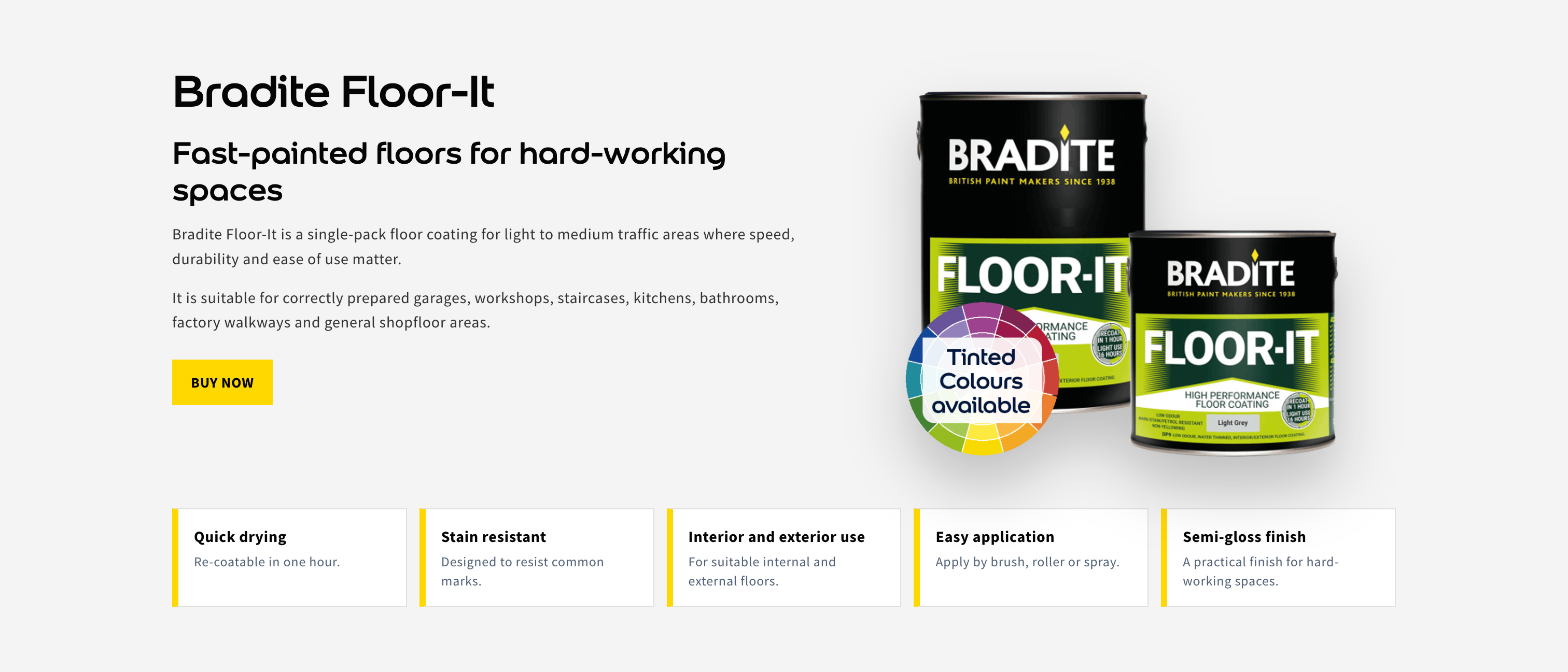
The page was developed using HTML and CSS within the Dulux Decorator Centre content management system, ensuring the final implementation remained responsive, accessible and consistent with the wider platform.
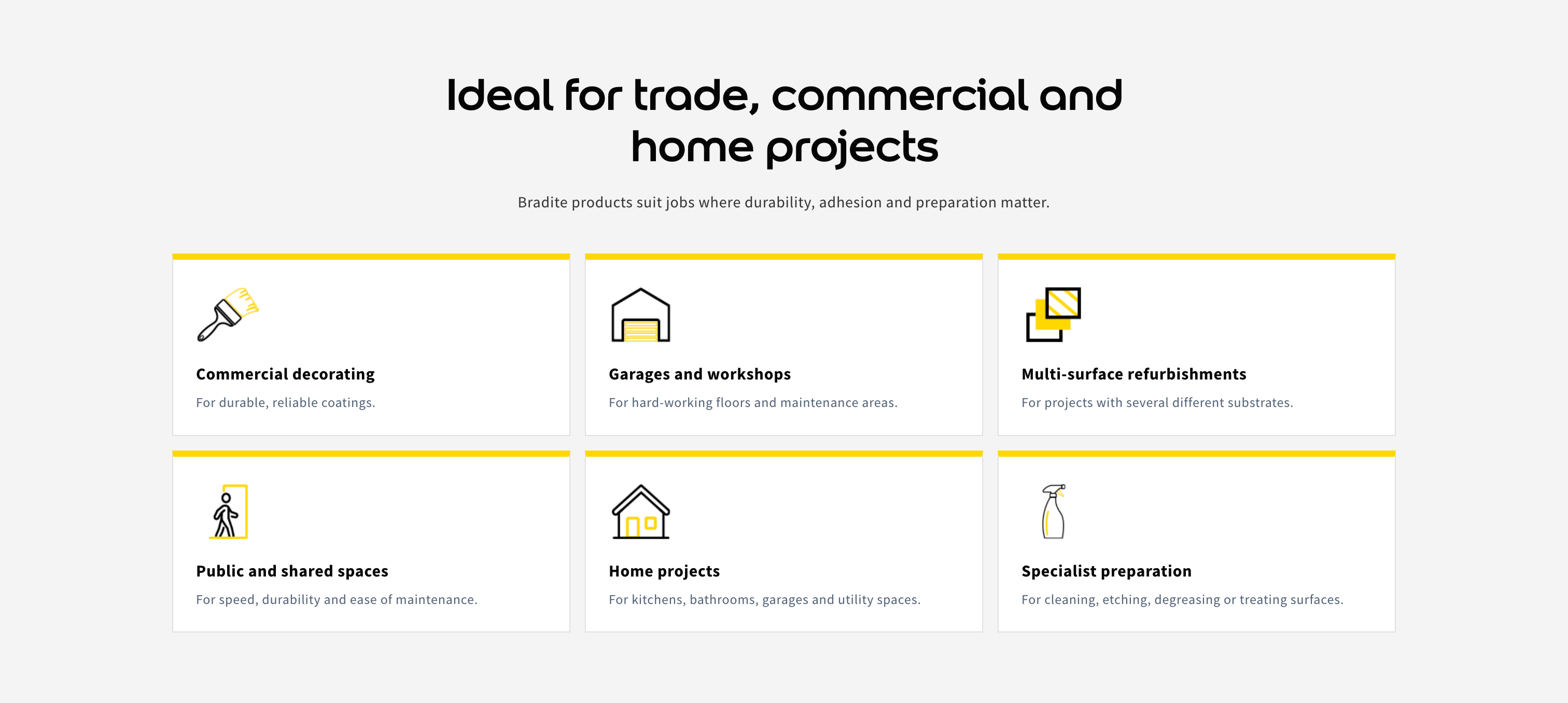
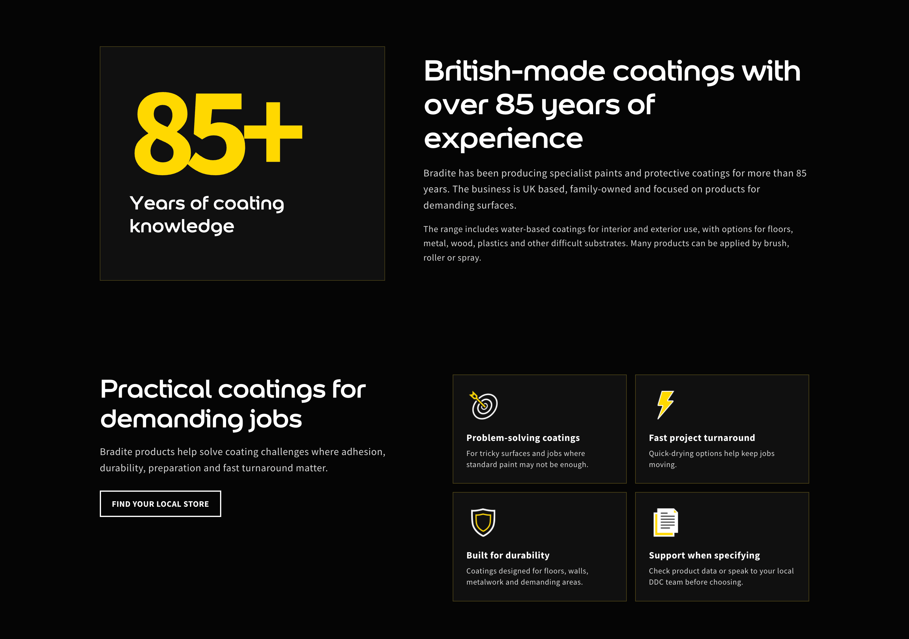
Particular attention was given to:
The completed landing page delivers a significantly stronger visual presentation for the Bradite brand while transforming the existing product-led page into a clearer, more structured browsing experience.
The redesign creates a clearer product hierarchy, modernises the page layout and provides customers with a clearer, more considered journey through the brand’s specialist product offering. The project also established reusable design patterns that can support future brand pages across the Dulux Decorator Centre website.

This project reinforced the importance of this project reinforced the importance of creating a visual language that reflects the personality of an individual brand without disconnecting it from the wider website experience. The Bradite page needed to feel unmistakably Bradite, but it still needed to behave and feel like part of Dulux Decorator Centre.The bespoke iconography and page structure also demonstrated how relatively small design decisions can establish that identity without adding unnecessary complexity.
Designing bespoke iconography and carefully structuring the page demonstrated how relatively small design decisions can contribute to a more cohesive, engaging and user-focused experience without introducing unnecessary complexity.