
The Community Hub needed to feel real, quickly.
Not “we support good causes”, but clear proof, recognisable partners,
and a browsable set of projects people can dip into.
The page is designed to do two jobs at the same time:
I designed and built the page within the Dulux Decorator Centre site, working inside an established brand and component system.
My work covered:
Tools: VS Code, Photoshop
Community content can get messy fast — lots of stories, lots of locations, lots of images, and no single “buy now” journey.
This page had to:
Rather than treating it like a blog archive, the page is built as a
layered hub:
Commitment → Proof → Spotlight → Browse → Next step
That structure keeps the scroll feeling intentional. People get the “why” and the proof first, then the page opens up into exploration without losing control.
Trust needs to be visible — not hidden.
So the page makes impact and credibility easy to spot early on, before you ask people to scroll through lots of content.
This is the difference between a hub that feels meaningful… and one that feels like “just another page”.
The partners area acts like a credibility bridge. Recognisable organisations + short descriptions give instant context, without needing a big wall of text.
It’s also structured in a way that stays tidy as new partners get added.
A single featured story gives the page weight. It turns the hub into something that feels lived-in and real, not just stats and tiles.
It’s also a natural “pause” in the scroll before you hit the larger project library.
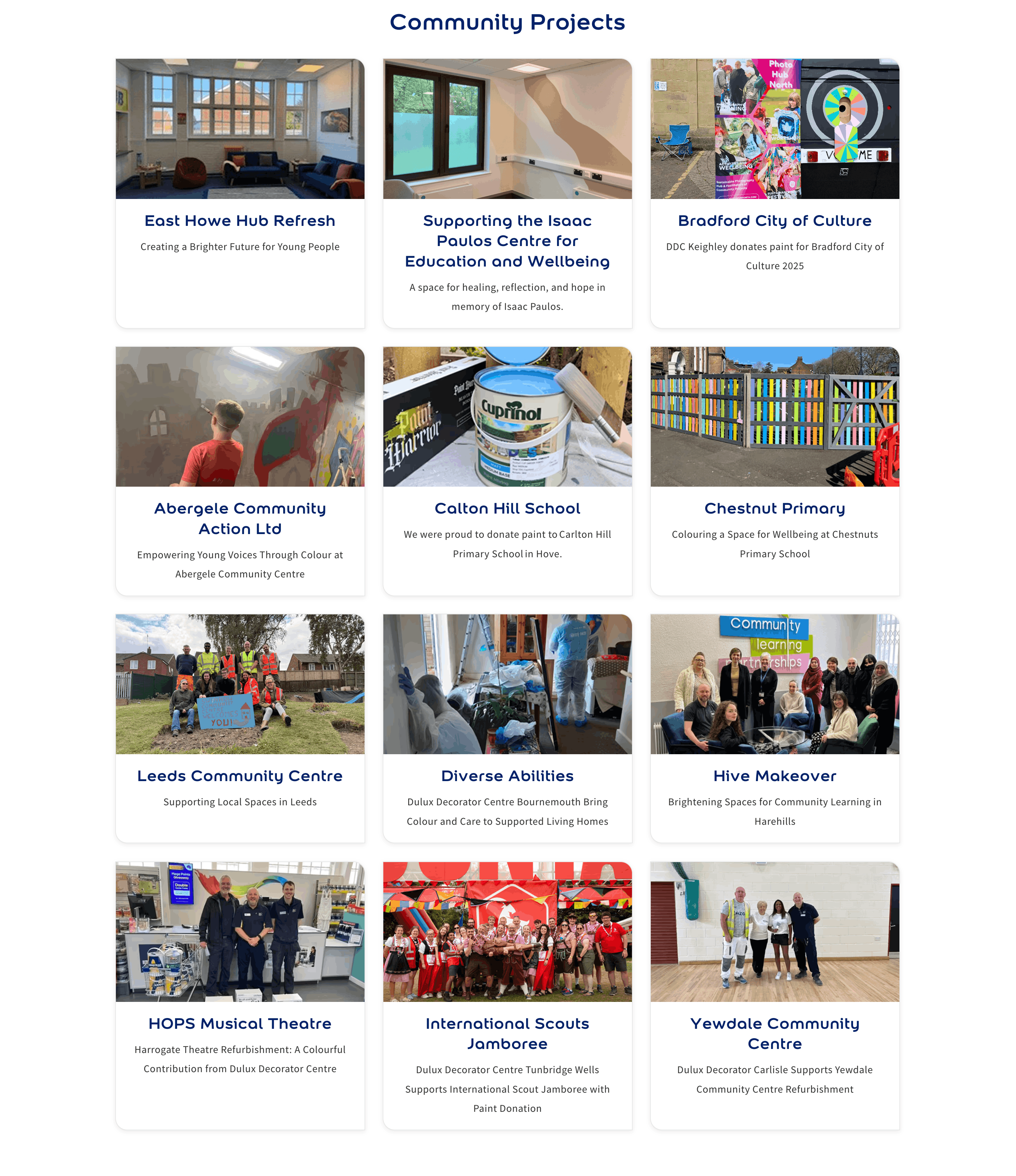
Once trust is established, the page switches into browse mode, a consistent grid of cards that people can scan quickly.
The layout is doing a lot of invisible work here:
So it still feels calm even with lots of content on screen.
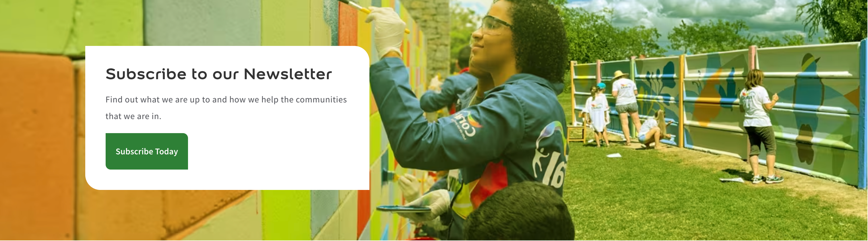
The end-cap CTA is there for people who’ve bought into the story and want to stay connected, but it’s not pushy, and it doesn’t interrupt the browsing sections.
The finished page presents community work in a way that feels
credible, structured, and easy to explore.
It leads with proof, supports it with partners, adds depth with a spotlight story, then gives people a clean way to browse the wider catalogue of projects. That combination makes it feel like a proper hub, not a dumping ground.