A campaign-led digital rollout built from official product branding and extended into a full web experience through original page design, motion treatment, landing pages and front-end implementation.
This project was created to give Dulux Trade Durable Kitchen & Bathroom a stronger digital campaign presence across the Dulux Decorator Centre website. The rollout centred on a homepage takeover, supported by two linked landing pages and a persistent promotional widget that stayed visible across the wider site.
The aim was not just to make the campaign look bold. It was to translate the product launch into a joined-up web experience that felt visible, cohesive and commercially useful across multiple touchpoints.
The official campaign artwork and product branding came from the main Dulux team. My role was to take that direction and build it out into a digital campaign experience for the site.
That included:
So while the core campaign branding was already established, the web design system, page layouts, motion treatment and build were my own.
The challenge here was to make the campaign feel like a real part of the site rather than a flat promotional overlay.
The product needed strong visibility on the homepage, but the experience still had to feel usable and joined-up. It also needed to extend beyond one page.
This was not a single landing page exercise. It involved:
That meant the work had to hold together visually and structurally across several touchpoints, not just look good in one place.
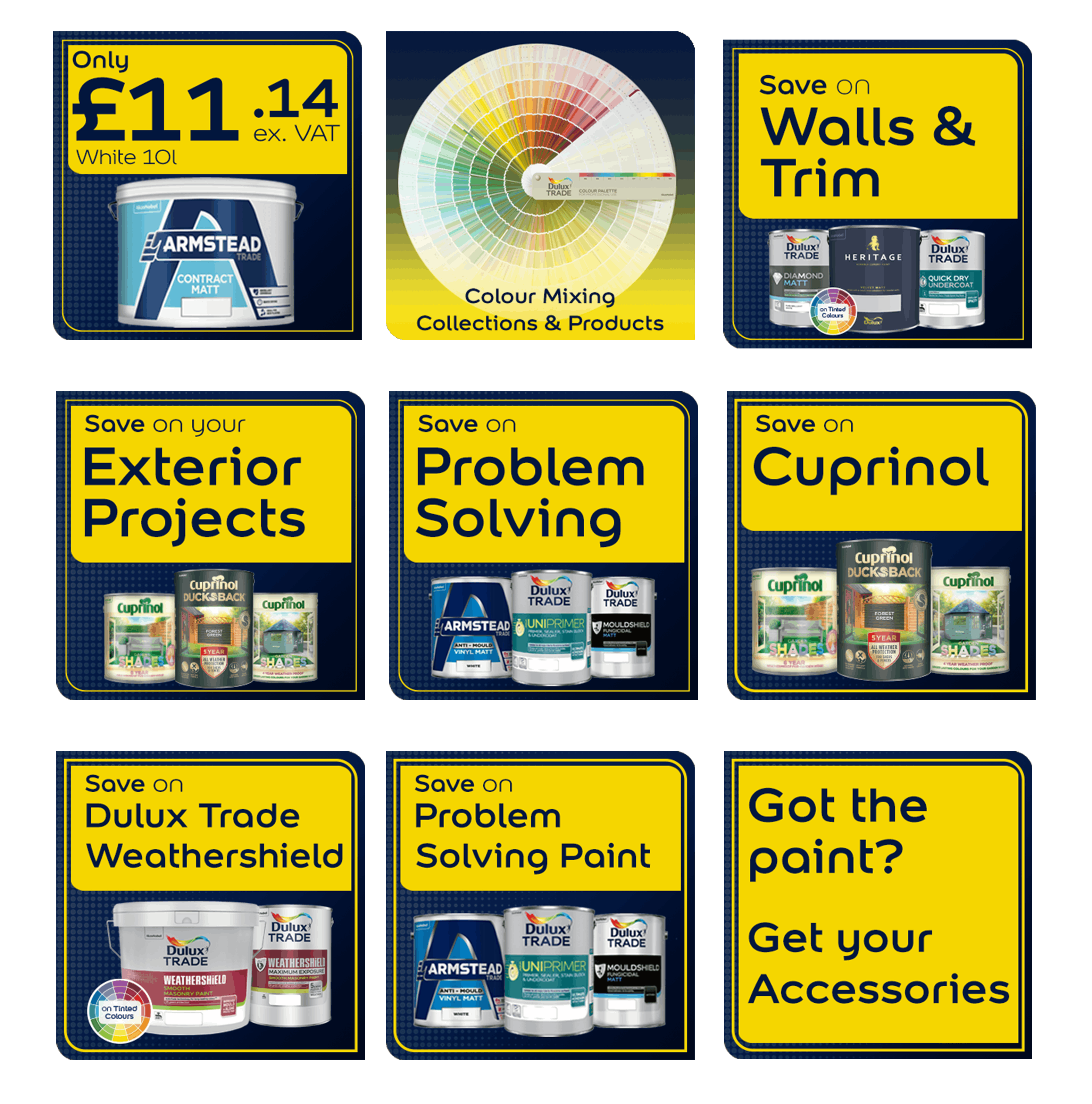
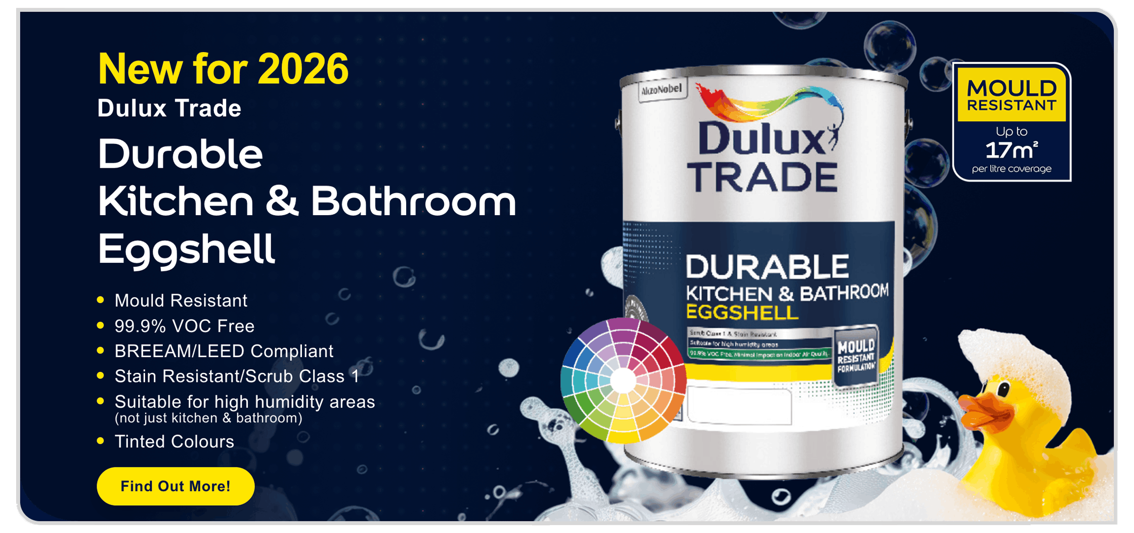
The homepage takeover was designed to give the product immediate visual presence.
Using the official campaign look as the starting point, I built a takeover that brought the launch into the wider site through bespoke layouts, campaign-led tiles and a stronger visual rhythm across the page.
One of the key design features was the animated bubble treatment.
On the homepage, the bubbles were used as a major part of the visual experience rather than just light decoration. They actively float upward through the page, giving the takeover more movement and depth and helping it feel more immersive than a static promotional build.
That mattered because the homepage needed to do more than display artwork. It needed to feel alive enough to earn attention.
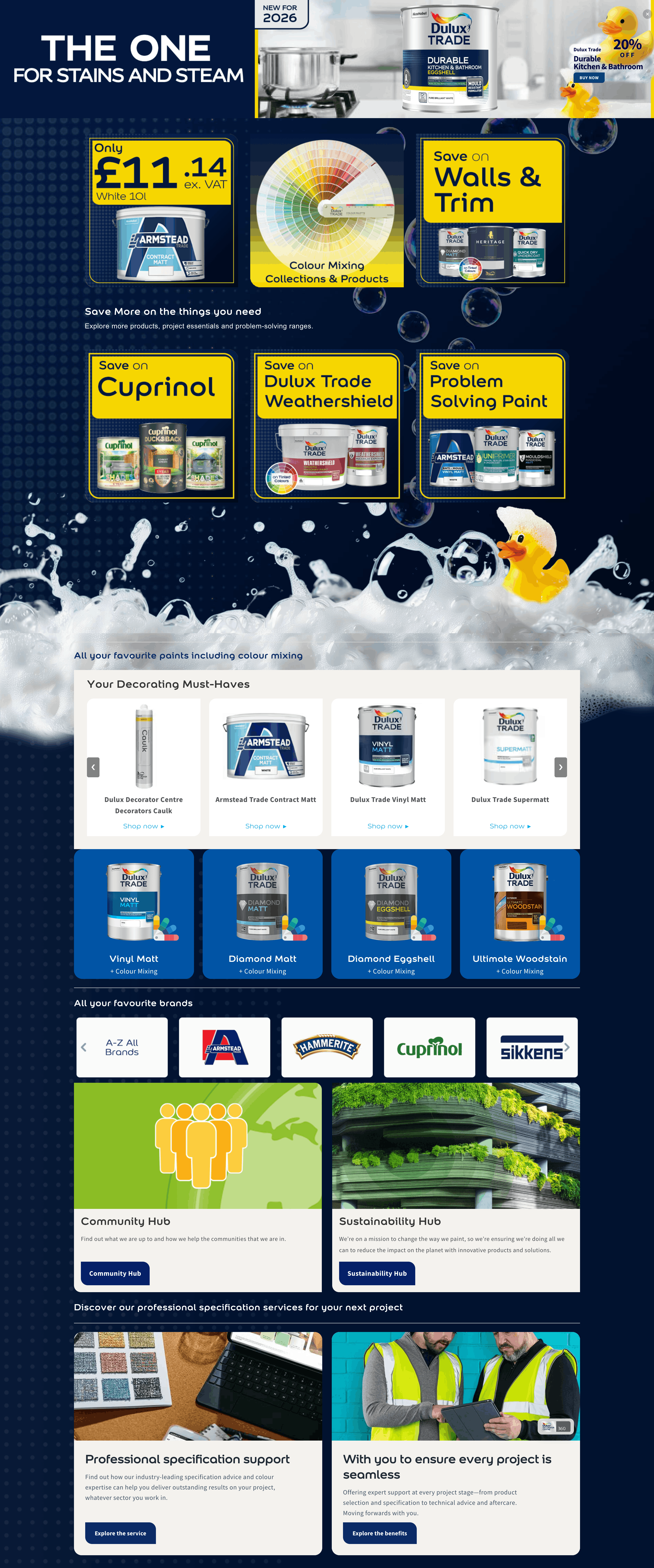
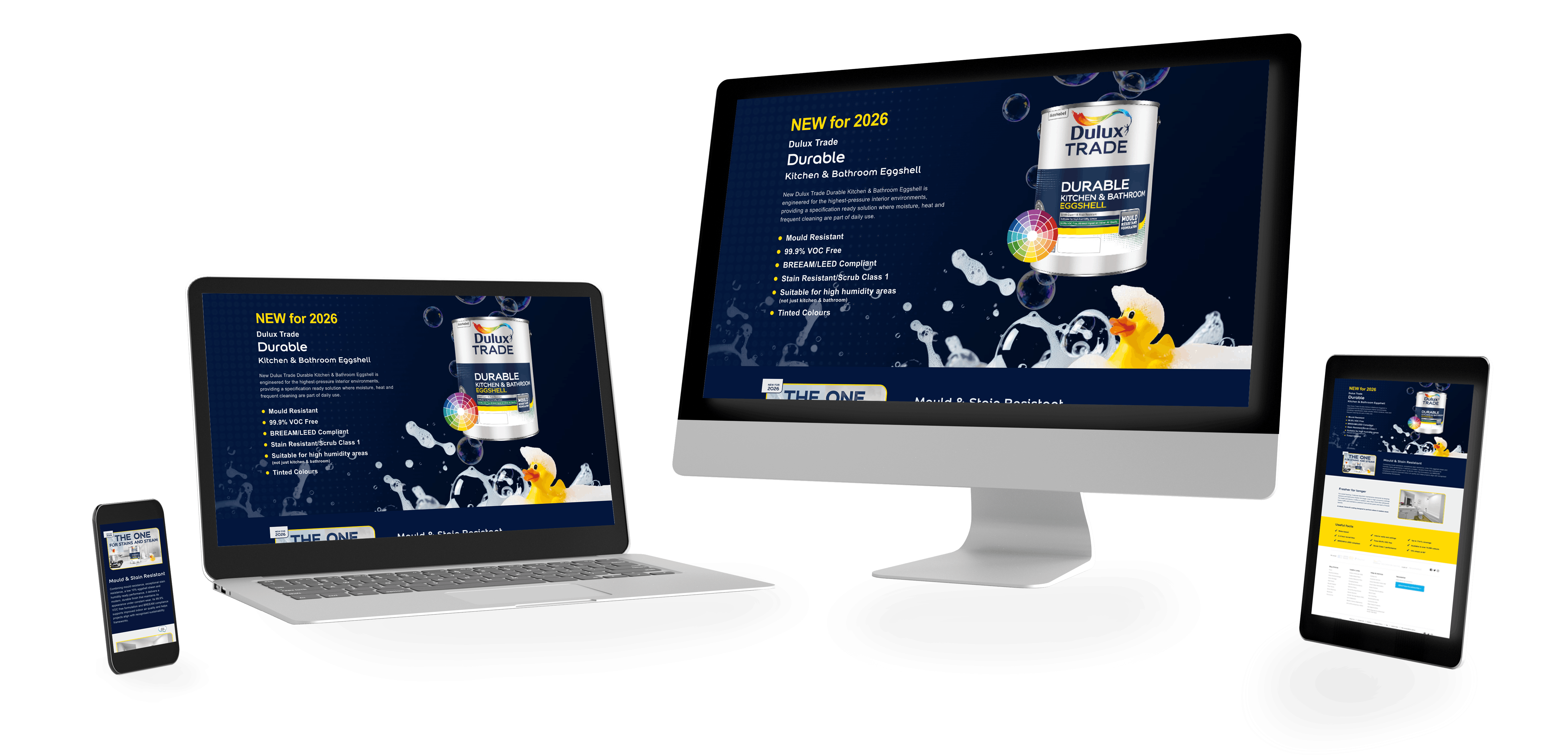
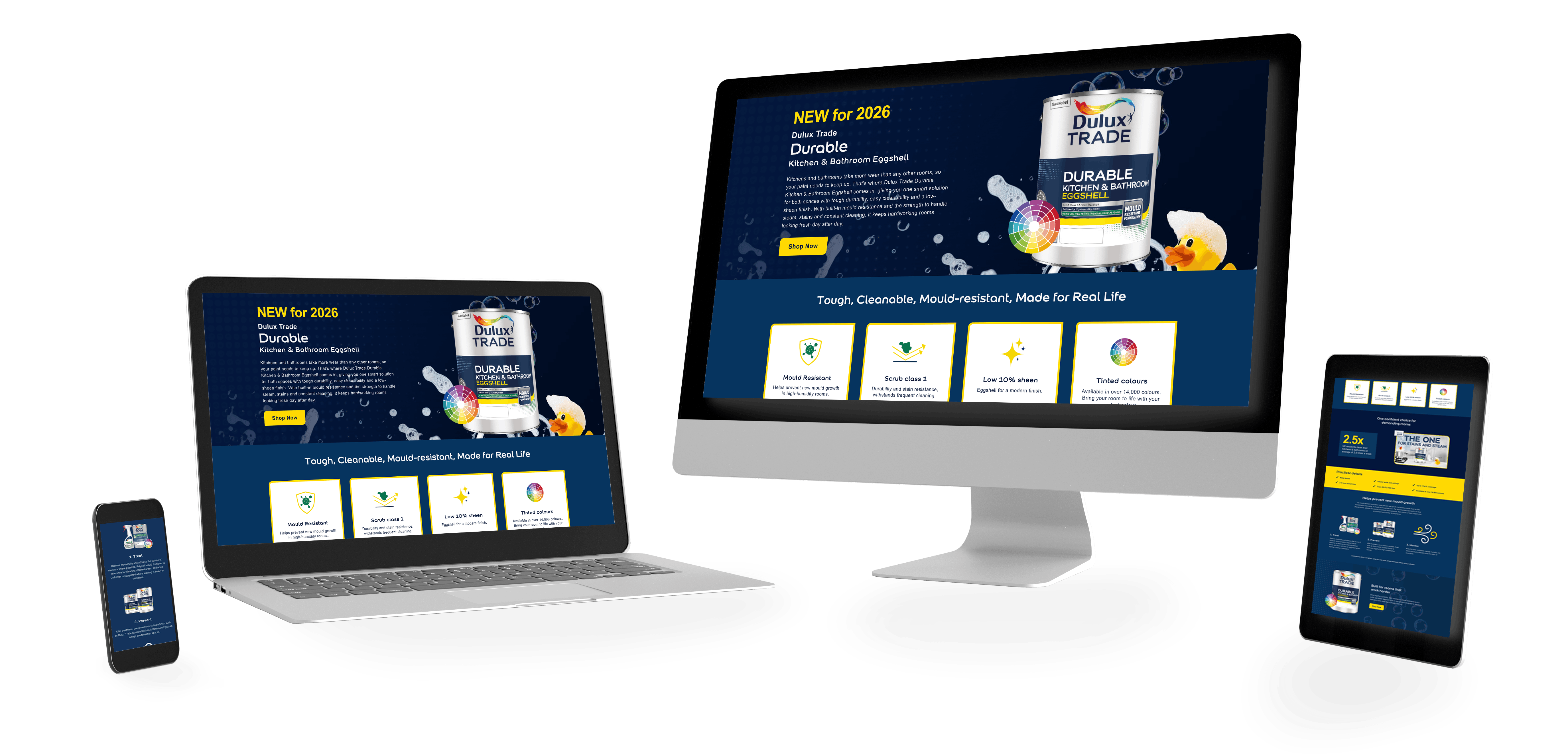
The campaign was supported by two linked landing pages.
The main landing page gave the product more room to breathe and helped extend the campaign beyond the homepage through more focused messaging, supporting visuals and a clearer branded journey.
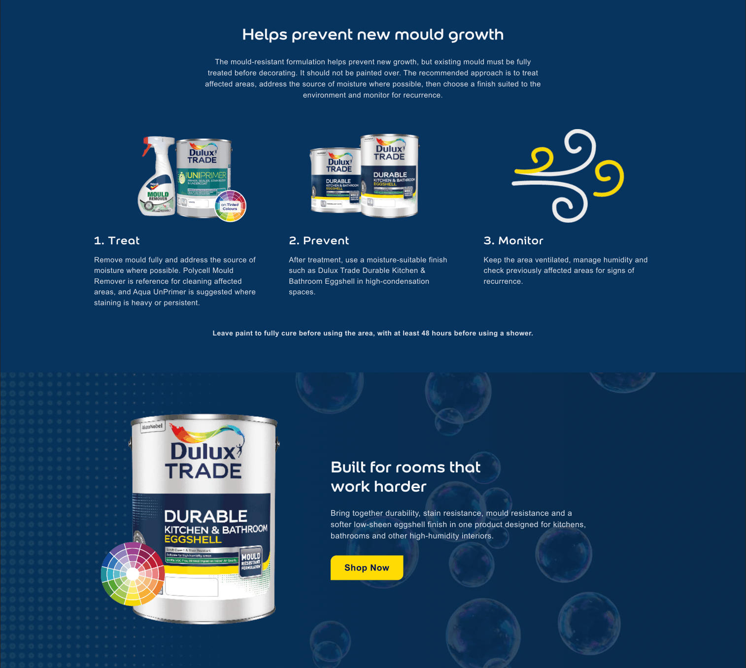
Alongside that, the specifiers page gave the campaign a more specific route for a more targeted audience.
That split was important.
Rather than trying to force one page to speak to everyone, the campaign used different pages for different user needs:
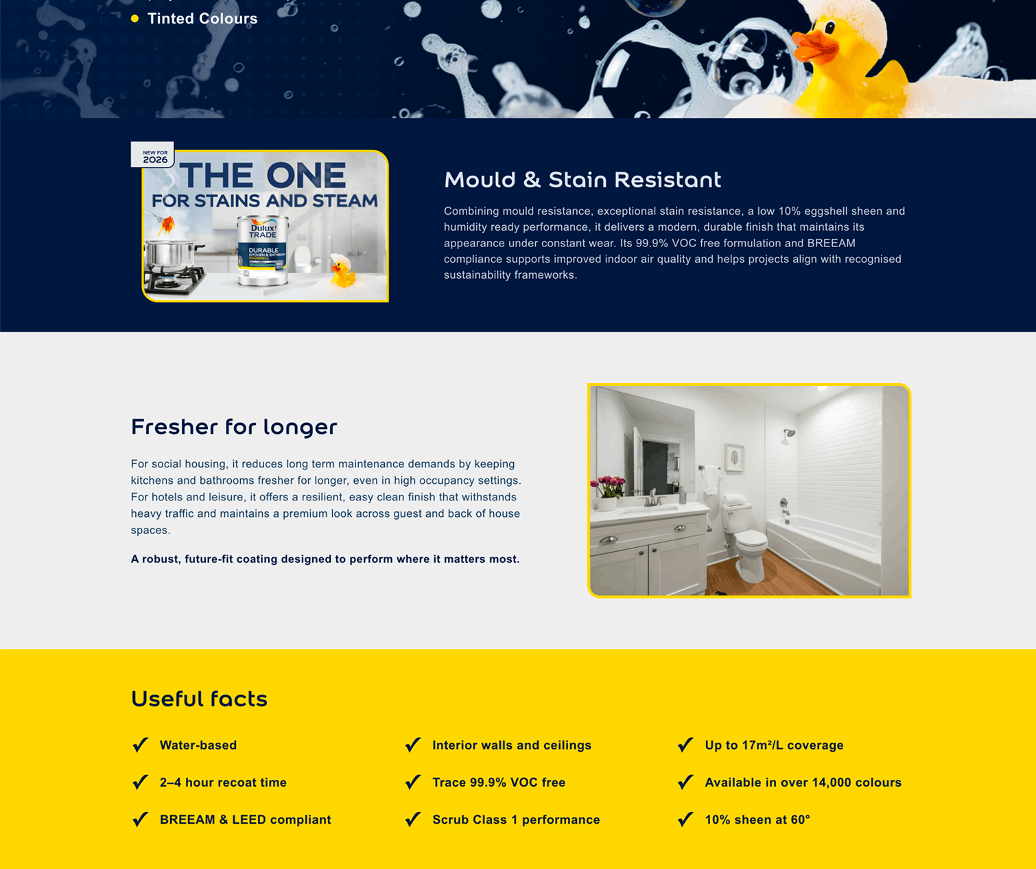
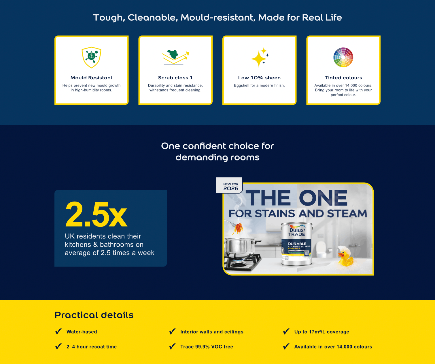
A big part of this project was making the campaign feel less flat.
The bubble treatment helped carry the kitchen and bathroom theme across the experience, but it was used differently depending on the page.
On the homepage, the bubbles were far more prominent and became part of the main design language. On the supporting pages, they were used more lightly in the header areas to keep visual continuity without overwhelming the content.
That difference in treatment was deliberate.
The homepage needed more energy and a bigger visual moment.
The landing pages needed consistency, but with more restraint.
The duck widget was another key part of the rollout.
It stayed visible on the right-hand side of the site as users moved through different pages, unless they chose to close it. That meant the campaign could stay present beyond the homepage and landing pages.
The widget linked directly through to the Kitchen & Bathroom product page, so it acted as a persistent route back into the buying journey rather than just a decorative campaign element.
That helped the launch work across the wider site, not only in its dedicated campaign spaces.

This project gave Dulux Trade Durable Kitchen & Bathroom a stronger, more joined-up digital campaign presence across the Dulux Decorator Centre site.
Instead of relying on one static promotional page, the rollout used:
to keep the product visible across multiple touchpoints.